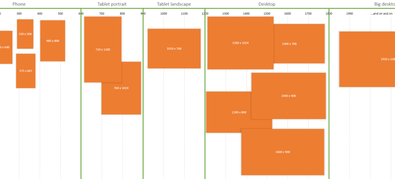
Breakpoints are the point a which your sites content will respond to provide the user with the best possible layout to consume the information.
When you first begin to work with Responsive Design you will define your breakpoints at the exact device widths that you are looking to target. Most often these are the smart phone (usually the iPhone at 320px and 480px), the tablet (usually the iPad at 768px and 1024px) and finally anything above 1024px.
WRONG!
I hope I didn’t hurt your feelings but seriously, you’re approaching this in the wrong way.
Instead of being concerned with device breakpoints the best practice is to design for your smallest viewport first. As you expand that view there will come a point at which the design looks shit terrible. This is where you add a break point.
Mobile First
Approaching the design mobile first is the best approach for a responsive design. It allows you to layout the content that is most important to your customers in a clear and logical way on the smallest screen real-estate. This will force you to really identify what is the most important information on your site.
It is at this point that the majority of your branding and style work is done as well with larger layout overrides included in increasing media query widths. See mobile first CSS for more information.
Which devices should I target?
The purest answer is none of them.
More and more devices are going to come to the market and it seems silly that a device with 767px assumes a 480px design because that’s where you set the breakpoint. Instead if it were set at 800px and again at 600px (or at what ever point the design looked shit) then you cover ANY device that comes along tomorrow, next week, and years into the future.
If you do want to target specific devices we’ve still got you covered, check out this list of common device breakpoints for responsive design.
SUPER wide resolutions
Things…… can only get better…. can only get BETTER.
Also, they will get bigger and Bigger and BIGGER. Remember buying a 34cm television? Now I have a 42inch television. Screen sizes and resolutions will be bigger and bigger so we need to ensure that our designs look good on these. You can set a super wide break point (see if you can find the easter egg in our super wide break point) to keep your content from edge to edge, but best practice would be to set a max-width on your container.
#container {
    margin: 0 auto;
    max-width: 18000px; /* A really big width */
}
And along with super wide resolutions, we need to start looking at the pixel density issues (or opportunities depending on where you are coming from).
While it won’t really affect the breakpoints that you choose it is something you will need to take into considerations when it comes to loading background images (so yes for mediaqueries but maybe not an actual physical width breakpoint) and for content based images.
Very exciting times indeed.


