Creating the Periodic Table with Grid CSS
 A notebook you'll actually carry every day.
The CSS Grid specification provides us with the ability to take web design to the next level without having to succumb to adding in otherwise un-needed HTML or the use of CSS hacks (looking at your floats).
tldr
If you just want to see code then here it is…. make sure you enable flags in your browser.
See the Pen Periodic Table Grid CSS by Justin Avery (@justincavery) on CodePen.
//assets.codepen.io/assets/embed/ei.js
The other day I was racking my brains around the best use of the grid system, because at the time I was kind of at the point where I thought “meh, sure it lays out the page in the same way that we’ve been doing things for years. What’s the real benefit”.
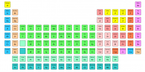
Out of nowhere I suddenly thought about the periodic table. Was it really a table? Was the information in a tabular form because it needed headings and rows, or was it called a table because that was the best visual representation of the data.
What would a periodic table look like if I built it from a purely semantic point of view in HTML, and how would that then translate to the screen from a visual design point of view.
As a word of warning on this … I probably haven’t approached the CSS Grid Layout in the best way possible, and the approach that I’ve used (very much a large viewport first) goes against everything that I would usually preach for approaching content design. The reason for this is I was more concerned about replicating the desktop version of the design through the use of Grid and less concerned about how best to display that information on smaller screens (although I do start to get to that at the end of the process).
Semantic HTML
I had a long chat with a colleague at work about what a semantic periodic table might look like (or code like) and I also took the question out to twitter.
Some people believed that it was tabular data and it should be in a table, but I wasn’t so sure about setting empty <td> elements and spanning columns after all that HTML was only in there to support the design layout rather than being strictly required to be semantic.
I ended up settling on an ordered list <ol> as essentially it is a list of elements in an order. One of the things that I haven’t approached yet is laying out all the data within the cells (mainly because this was an exercise to learn CSS Grids) but I did give it some thought.
Within the list of elements there is information that is consistent, and comparable with each of the other elements. For example, you would likely want to know all the Metals or Halogens which are the Block Group types. You would also might want to know the Group or Period or the Atomic Weight.
After a bit of discussion, I decided that these things would be best represented as Definition Lists with a format similar to the below example.
<li>
<h2>Hydrogen</h2>
<dl>
<dt>Atomic Number</dt>
<dd>1</dd>
<dt>Atomic Mass</dt>
<dd>1.00794(4)</dd>
<dt>Electronic Configuration</dt>
<dd>1s1</dd>
<dt>Atomic Radius</dt>
<dd>37</dd>
<dt>Group Block</dt>
<dd>Non Metal</dd>
<dt>Group</dt>
<dd>1</dd>
<dt>Period</dt>
<dd>1</dd>
<dt>Year Discovered</dt>
<dd>1766</dd>
<dt>Standard State</dt>
<dd>Gas</dd>
<dt>Density</dt>
<dd>0.0000899</dd>
</dl>
</li>
Aside from making those element human readable I also knew at some point that I wanted to both target some of those values through styling (each Group Block has it’s own background colour for example) but also for sorting and grouping for more progressively enhanced plans for the future. To achieve this I added several data attributes to the <li> tags including data-element-group, data-group, data-period.
At the time of writing this there aren’t any Microformats that fit into this, but it’s something that I’d add in the future.
Now that I had my HTML sorted it was time to move on to the CSS Grid layout itself.
Working out the CSS Grid
The first step was to work out how it was going to be laid out…. how many columns did I need and how many rows were needed. When it comes to the Periodic Table this seemed fairly straightforward. I just needed to look at the table, count out the number of columns (groups) and the number of rows (periods) and I was sorted.
There are 18 columns and 7 rows in a typical Periodic table (not counting the additional Lanthanides and Actinides&hellip; but my oversight was not a problem and I dealt with them at the end).
To set this I applied the following CSS Grid rules to the parent element of the grid items, the parent being <ol class=”wrapper”>.
.wrapper {
display: grid;
grid-gap: 5px; // Set the gap between the grid rows and columns at 5px.
grid-template-columns: repeat(18, 1fr); // create 18 columns, make them all 1 fraction or 18/100 in width.
grid-template-rows: repeat(7, 50px); // create 7 rows, make them 50px tall.
max-width: 1140px;
margin:1em auto;
}
As far as I could establish the reason that the .wrapper and CSS Grid declarations had to be applied to the ol is because in the current implementation of the CSS Grid the grid items have to be a direct child of the parent element to take on the declarations. In other words the below example will apply the Grid to the list items…
<ol class=”wrapper”>
<li class=”h element”>…
…..
</ol>
But the following code will not:
<div class=”wrapper”>
<ol>
<li class=”h element”>…
…..
</ol>
</div>
The max-width and margin didn’t have to set on the list, that could have been done on the parent and the list set to 100% but I was just being lazy in not creating another class as a wrapper (not sure it was necessary really).
Now that the grid was set out it was time to apply the positioning to the elements.
Setting the content into CSS Grid containers
With the grid set out, it was time to start positioning each of the elements into the table.
If I were to skip this step the grid items would populate our defined grid starting from row 1 column 1 for Hydrogen, moving to row 1 column 2 for Helium, and so on and so forth. When we reached row 1 column 18 we would have Argon occupying the position (element #18), and then Potassium (#19) would be found on row 2 column 1.
This doesn’t fit the layout of a Periodic Table, so I needed to provide each of the li elements a fixed grid position.
To keep everything clean so that I could work out how things were working I decided to set the .element class (which was applied to every item to give it consistent styling) to be in a fixed position on the Grid which meant every single item was stacked on that spot until I provided an override for it with a specific class that was created for every element by using the element symbol&hellip; i.e .h for Hydrogen, .he for Helium etc.
The CSS for that looked like this:
.element {
grid-column:18;
grid-row:18;
}
…. and then I went through a started creating the overrides for each element
.h{grid-column:1; grid-row:1;}
.he{grid-column:18; grid-row:1;}
.li{grid-column:1; grid-row:2;}
.be{grid-column:2; grid-row:2;}
.b{grid-column:13; grid-row:2;}
.c{grid-column:14; grid-row:2;}
Hydrogen occupies the first spot on the table so gets the coordinates of 1 and 1. Although Helium is the second element on the Periodic table it actually occupies the last column on the Grid but stays on the first row, thus coordinates 18 and 1 (column and row). The next element is Lithium, Beryllium, Boron, Carbon etc which all occupy very specific places on the Periodic Table Grid.
I managed to get through the first 30 elements by writing the HTML and CSS out manually before it occurred to me that any mistakes I made meant a lot of fixes&hellip; so some kind of generated output would be better.
Automating the Grid CSS & HTML
One of the tweet replies was from Orangetron jokingly telling me to npm periodic-table when I first asked about the sematic layout. This actually turned out to be a good resource as it provided me with almost all the data I needed.
After getting the CSV of the data I found that it was missing both the Period (row) and the Group (column) but everything else I needed was there. I updated the spreadsheet/CSV and imported into a MySQL database and then came up with the following query (after much trial and error).
What I needed was to automatically spit out the class name based upon the atomic symbol, followed by the grid-column and grid-row based on the Group and Period respectively.
$sql = “SELECT * FROM `TABLE 1`”;
$result = $conn->query($sql);
if ($result->num_rows > 0) {
// output data of each row
while($row = $result->fetch_assoc()) {
echo “.” . (str_replace(‘ ‘, ”, strtolower($row[” symbol”]))) . “{grid-column:” . $row[“group”] . “; grid-row:” . $row[“period”] . “;}n”;
}
} else {
echo “0 results”;
}
With that in place, I suddenly had all the styles I needed in a flash.
As an aside…. when I say “flash” I really mean 4 hours of me wrestling with working out how to create a database, connect to a database in PHP, find how to loop through results and then fix a number of user errors before it worked. I could have easily hand-coded it in this time… but now I’ve learned something new and it’s much easier to update the HTML and CSS now it’s done if I need to.
I then turned my attention to the HTML.
while($row = $result->fetch_assoc()) {
echo “<li data-element-group='” . (str_replace(‘ ‘, ‘-‘, strtolower($row[” groupBlock”]))) . “‘ data-group='” . $row[“group”] . “‘ data-period='” . $row[“period”] . “‘ class=’element” . (strtolower($row[” symbol”])) . “‘>”;
echo “<h2>” . $row[” name”] . “</h2>” . “<i>” . $row[” symbol”] . “</i>” ;
echo “</li>”;
}
Here I’m looping through the results and kicking out each of the elements within a li tag while also setting some data attributes like data-element-group. There’s some extra code around the groupBlock to make them all lower case and swap any spaces for dashes so that they can be used later on. Those of you with a keen eye will notice that some of the items I’m adding in, for example, $row[“name”] has a space in front of the name. That’s not some fancy trick, but instead, when I uploaded the CSV into the MySQL database some of the headings had some spaces at the front. I really need to go back and clean that up, but it’s not high on my agenda at the moment ;).
With that all automated and done I was happy and turned to styling up the colours of the Block Groups.
Styling up the Grid elements
Each Block Group has a specific name and a colour associated with it. I could have added them as classes on the element, but because I was already using the data-element-group attribute there was no need to double up.
I applied background colours through the following CSS
[data-element-group=”metalloid”] {
background-color: #FF9999;
}
Once there was some colour to define the groups I suddenly realised there was something wrong with my approach.
Fixing problems with ease, I <3 CSS Grid
The issue with the periodic table is that from element 57-71 and 89-103, the Lanthanide and Actinide series, actually only occupy a single cell each in the main Periodic Table and are referenced in full in a small table underneath.
In essence in Period(or row with relation to the Grid) 6 & 7 and Group (or column with relation to the grid) 2—16 there are two elements that occupy the same place on the table. Because the Actinide and Lanthanide series are further down the list the CSS Grid position is applied later on and they sit on top of the elements that should be in the table.
Fortunately,there was an easy fix.
I needed to extend my CSS Grid layout rows to 9,
.wrapper {
display: grid;
grid-gap: 5px;
grid-template-columns: repeat(18, 1fr);
grid-template-rows: repeat(9, 50px);
max-width: 1140px;
margin:1em auto;
}
and then update the CSS for the Lathanide and Actinide groups to position them 2 rows lower in the CSS Grid.
The query below targets only the elements that are lanthanoids or actinoids, and while I leave the Grid Column the same I take the Period (or row with relation to the Grid) and add 2 so that row 6&7 become row 8&9.
$sql = “SELECT * FROM `TABLE 1` WHERE ` groupBlock` = ‘lanthanoid’ OR ` groupBlock` = ‘actinoid'”;
// ….
while($row = $result->fetch_assoc()) {
echo “.” . (str_replace(‘ ‘, ”, strtolower($row[” symbol”]))) . “{grid-column:” . $row[“group”] . “; grid-row:” . ($row[“period”] + 2) . “;}n”;
}
And BAM! it just worked! That did leave me with two element holes in the periodic table, positions that would usually be a reference point for the new rows I’d added at the bottom of the main table. For these I’ve added
<div class=”element lanthanoid” data-element-group=”lanthanoid”></div>
<div class=”element actinoid” data-element-group=”actinoid”></div>
and then dropped them into their placeholder areas on the main table with
.actinoid {
grid-column:3;
grid-row:7;
}
.lanthanoid {
grid-column:3;
grid-row:6;
}
And voila, I have a Periodic Table in semantic HTML but maintaining the visual design originally intended.
Adding the Element details to the Grid
One thing that I reaslised when trying to get all the information into the cells is that the periodic table has a LOT of data agaist each element, and to fit it on to a traditional screen is&hellip; well very difficult.
I decided that I could use the space at the top of the grid to include information about a selected element, and while I haven’t got around to adding the functionality to select elements the act of creating a space is very easy.
.feature-element {
grid-column: 3/9;
grid-row: 2/4;
background: #eee;
}
Think of the above like Merging Cells in Excel. I’m saying that I want an element to occupy between the 3rd colum row through to the 9th column, and from the 2nd column to the 4th column&hellip; and give it a grey background (just so you can see it). My next steps will be that when an element is clicked it will show all of the dl information within that section&hellip; maybe with a little svg of the composition as well.
Progressively enhancing the CSS Grid
Once I finished it I shared it with a few friends who saw a long list of stacked elements that streteched out 100% of the viewport.
Hmmmm.
It’s not the worse thing in the world, but also not necessarily the best.
I’d built this to learn CSS Grid and gave no thought to browsers that didn’t support it, which is pretty stupid seeing as currently no browsers support it.
To overcome this I decided to use @supports . This is like a media query, but intead of testing the viewport width or height it checks the browsers support of the rule you want to use.
For the Grid it’s as simple as wrapping all of your Grid CSS specific code in
@supports (display: grid){
*/ Your CSS Grid specific stuff /*
}
That was great, but now it just still looked the same as before because now instead of the styles being applied, not understood, and skipped they were now not being applied at all.
The next step I thought was to arrange the elements using Flexbox because, well why not. It wouldn’t give me the same layout but it would make the elements flex nicely into a grid.
For this I initially applied the same approach
@supports (display:flex) {
/* my flex styles */
… but then when I checked the version on a CSS Grid supported browser it was broken!
It took me a moment to realise but of course, any browser that supported display: grid; would also support display: flex; , and because of the way the CSS was ordered it was overriding the Grid.
Rather than rearrange the CSS I decided to employ the not selector.
@supports (not(display: grid)) and (display:flex) {
This means that any browser with flex and grid support would skip this because it fails on the first test.
I did then toy with the idea of applying the following to target browsers that didn’t have flex or grid support so that I didn’t need to change the float and size properties in the other declarations….
@supports (not(display: grid)) and (not(display:flex)){
.element {float: left;
min-width: 75px;
min-height: 50px;
margin: 3px;}
}
…. but then it occured to me that any browser that didn’t support Flex also didn’t support the @supports approach so those rules wouldn’t be applied anyway.
That’s a wrap
To be perfectly honest I’m not really satisfied with the way that it works when CSS Grid is not supported and need have a think about how it might be rendered in a better way, I’m open to any suggestions.
Seeing as this was a task to learn more about the Grid I think it was a successful mini project as I now have a much firmer grasp on some of the nuances of the implemenation and my mind is now working in dispaly: grid; mode rather than the display: flex; or float: left; , I hope it helped you discover some of the cool possibilities as well.
If you’re looking for more information I highly recommend checking out Rachel Andrews Grid by Example site, and also see what Jenn Simmons is doing on her lab both of which helped me along in this adventure.
See the Pen Periodic Table Grid CSS by Justin Avery (@justincavery) on CodePen.
//assets.codepen.io/assets/embed/ei.js