Responsive Grid Magazine Layout in Just 20 Lines of CSS
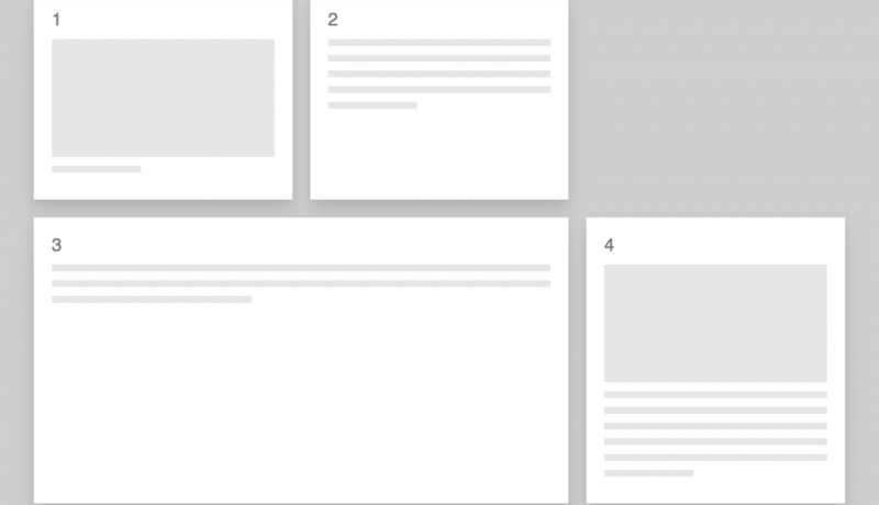
A really clever approach using a combination of Grid layout and nth-child declarations produces this lovely looking responsive magazine layout.
When I first came across CSS Grid I really struggled to understand how it was going to change the way in which we built our sites until I took some time to put the periodic tablet together using CSS Grid.

This magazine-style grid layout is fully responsive with the colored featured panels adjusting dynamically as the number of columns change. The page displays around 50 posts, but the layout code is agnostic as to the number of items displayed. Ramp up the plugin to show 100 items and the layout stays interesting all the way down.
All of this is achieved using only CSS and with only a single media query to deal with a single column display on the narrowest of screens (i.e. smaller than 460px).
An excerpt from Responsive Grid Magazine Layout in Just 20 Lines of CSS
 A notebook you'll actually carry every day.


