Getting your website ready for Apple Watch OS5
 A notebook you'll actually carry every day.
This week at the WWDC Apple announced what their new OS would contain. There wasn’t too much to jump up and down about, although I do like the limitations that you’re going to be able to place upon screen time (especially with two children under 5 who think it’s their iPhone/Pad and not mine).
One of the biggest bits of news for web developers/designers like you and I is that WebKit was properly being ported across to the Apple Watch and as of Apple Watch OS5 you would be able to browse websites.
Previously the email links inside of emails would ask users to move across to their phone/ipad/computer, but now the user will be able to open and interact with the web page on the watch itself, and the same thing goes for any messages that you might receieve containing a URL.
Let’s take a look at
- how this works
- Optimising your layout for Watch OS5
- Using forms
- Reader Mode
How Webkit works on Apple Watch
A lot of the features on the Apple Watch OS5 for browsing websites will follow the same UX as you are used to with the phone. The digital crown will still allow you to scroll through the web page vertically and you can also use your finger to do the same. A double tap on the screen will zoom into that section of the web page, and the same double tap gesture will zoom you back out again.
A hard press on the screen will give you back and forward (in history) control of the page, but you can also swipe left and right to move fowards and backwards in history (your web browser history, no actual history).
At the moment the Watch OS5 is focussed on getting you basic content through the watch so there are a few glaring omissions that you might expect from Safari, namely there is…
- No inline video playback
- No service workers
- No web fonts
Layout
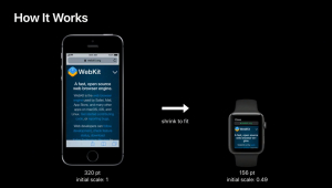
When the iPhone was first launched it was given a viewport of 320px. This same viewport is given to the Watch OS5, however, the view has been scaled down to 0.49 to produce the layout on the smaller screen. Remember, this means that the text and images are going to be 51% smaller but the layout for your mobile (likely to be a stacked layout) will remain the same.
This means that on the Watch OS5 the meta viewport tag initial scale is ignored and instead the scale is created to allow for the full page to be displayed. This means that although you’ve set the initial scale to 1.0, it will reduce that scale to 0.49.
The viewport for the Watch OS5 is therefore 320 x 357 but scaled back to 0.49, and the width for the media queries will resolve to the 320px width.
If you wanted to target particular CSS for the Watch OS5 (and we’ve explained in the past why you don’t need device specific media queries) then you would have the following
@media
(min-device-width: 320px)
and (min-device-height: 357px) {
}
You can override these defaults if you want though.
Let’s say there’s a gallery you’ve created of photos that are in two columns (50%) on a mobile screen.
When you add
<meta name="disabled-adaptations" content="watch">then WebKit knows that it doesn’t need to scale these down and will show them based on the real watch viewport and render them in one full-width column.
Form Controls on the Apple OS5 Watch
The interface for using forms has been optimised for the phone and it relies on you using the new specific kinds of form type controls to take advantage of these fields.
It supports number (type="tel"), date (type="date"), and select (<select>). This helps webkit to provide the right kind of interface for the users.
One of best things about the form controls is that they move you into full screen to complete each input. This means that it is important that you label your forms correctly and have the appropriate ARIA roles attached so users know what they’re filling out while they’re in the process of completing the form.
Safari Reader
For text heavy web pages the Apply Watch OS5 allows users to read the content with the existing Safari Reader mode. If you haven’t already, now is the time to update your article layout to ensure that you’re marking up your content to the best it can be.
Some tips to get your articles looking great in Safari reader
- Wrap the whole article in <article> tags
- Title should have itemprop=”title”
- Author should have itemprop=”author”
- Subheading should have itemprop=”subheading”
- Published date should have itemprop=”pubdate”
The more you can use semantic markup for your articles the better chance systems can index and display content for your users in the way that you indend so you CAN NOT do this enough.
Conclusion
For most of you building responsive websites you’re most likely to already be in a great position with almost nothing to do to improve your site for Apple Watch on OS5 (with perhaps the exception of adding the new meta tag).
For further information, watch the view below which covers the same stuff that is in the article.
