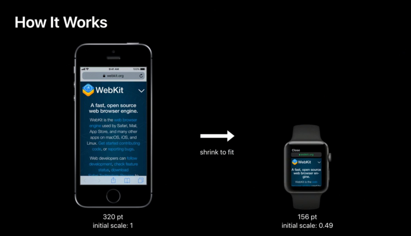
The viewport meta element is what turns a regular website page into a responsive page, and it’s also one of the number one reason for StackOverflow questions on why their media queries are not working.
What is the viewport element?
The viewport is a short tag that is included in the head of your HTML document that tells the browser how the page should be rendered. See the Best Practice example below
<meta name="viewport" content="width=device-width,initial-scale=1">
This is telling the browser to set the width of the content to the width of the device itself, and to scale that content to 1 on load.
Why do we need it?
When the iPhone was originally released Apple needed it to be suitable to consume websites the way they existed at the time. There was no way an internet browsing device was going to be successful if the websites that were being viewed were too big and the experience was poor.
To solve this problem Apple applied a neat trick within the safari mobile browser to tell the webpage that the content width was 960px — the targeted width for many websites at the time the first iPhone was released.
This meant that the website would then zoom so that it was easier to consume on the iPhone.
Fast forward to Ethans article and now we need to reset this bad practice because we were now developing sites to respond the width of the viewport (and on the iPhone it was being told the width was 960px).
What are the viewport options?
There are many options we can include in the content section of the meta viewport.
width. Sets the width of the layout viewport. In our case we set this to the “device-width” which overrides Apples default 960px.initial-scale. Sets the initial zoom of the page AND the width of the layout viewport. We set this to 1 which is the default view, but you can easily increase this number (not recommended).minimum-scale. Sets the minimum zoom level (i.e. how much the user can zoom out). This takes the control away from the user and something we never recommend.maximum-scale. Sets the maximum zoom level (i.e. how much the user can zoom in). Again this is not recommended because it takes away control from the user.height. Is supposed to set the height of the layout viewport. It is not supported anywhere…. so not really sure it’s included.user-scalable. When set tonoprevents the user from zooming. This is an abomination that MUST NOT be used. Even if you think you know what’s best for the user, you don’t, leave it alone.
Further Reading
I highly recommend going DEEP into the QuirksMode article
 A notebook you'll actually carry every day.

