A notebook you'll actually carry every day.
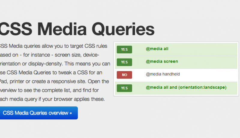
The @media query is 1/3 of the recipe for responsive design. It is the key ingredient that, in it’s simplest form, allows specified CSS to be applied depending on the device and whether it matches the media query criteria.
Before you start copying and pasting below, read why you don’t need device specific viewports. If you’re looking for details on the iWatch we’ve got you covered with getting your website ready for apply watch.
/* Smartphones (portrait and landscape) ----------- */
@media only screen and (min-device-width : 320px) and (max-device-width : 480px) {
/* Styles */
}

/* Smartphones (landscape) ----------- */
@media only screen and (min-width : 321px) {
/* Styles */
}

/* Smartphones (portrait) ----------- */
@media only screen and (max-width : 320px) {
/* Styles */
}

/* iPads (portrait and landscape) ----------- */
@media only screen and (min-device-width : 768px) and (max-device-width : 1024px) {
/* Styles */
}

/* iPads (landscape) ----------- */
@media only screen and (min-device-width : 768px) and (max-device-width : 1024px) and (orientation : landscape) {
/* Styles */
}

/* iPads (portrait) ----------- */
@media only screen and (min-device-width : 768px) and (max-device-width : 1024px) and (orientation : portrait) {
/* Styles */
}
/**********
iPad 3
**********/
@media only screen and (min-device-width : 768px) and (max-device-width : 1024px) and (orientation : landscape) and (-webkit-min-device-pixel-ratio : 2) {
/* Styles */
}

@media only screen and (min-device-width : 768px) and (max-device-width : 1024px) and (orientation : portrait) and (-webkit-min-device-pixel-ratio : 2) {
/* Styles */
}
/* Desktops and laptops ----------- */
@media only screen  and (min-width : 1224px) {
/* Styles */
}

/* Large screens ----------- */
@media only screen  and (min-width : 1824px) {
/* Styles */
}

/* iPhone 4 ----------- */
@media only screen and (min-device-width : 320px) and (max-device-width : 480px) and (orientation : landscape) and (-webkit-min-device-pixel-ratio : 2) {
/* Styles */
}

@media only screen and (min-device-width : 320px) and (max-device-width : 480px) and (orientation : portrait) and (-webkit-min-device-pixel-ratio : 2) {
/* Styles */
}

/* iPhone 5 ----------- */
@media only screen and (min-device-width: 320px) and (max-device-height: 568px) and (orientation : landscape) and (-webkit-device-pixel-ratio: 2){
/* Styles */
}

@media only screen and (min-device-width: 320px) and (max-device-height: 568px) and (orientation : portrait) and (-webkit-device-pixel-ratio: 2){
/* Styles */
}

/* iPhone 6, 7, 8 ----------- */
@media only screen and (min-device-width: 375px) and (max-device-height: 667px) and (orientation : landscape) and (-webkit-device-pixel-ratio: 2){
/* Styles */
}

@media only screen and (min-device-width: 375px) and (max-device-height: 667px) and (orientation : portrait) and (-webkit-device-pixel-ratio: 2){
/* Styles */
}

/* iPhone 6+, 7+, 8+ ----------- */
@media only screen and (min-device-width: 414px) and (max-device-height: 736px) and (orientation : landscape) and (-webkit-device-pixel-ratio: 2){
/* Styles */
}

@media only screen and (min-device-width: 414px) and (max-device-height: 736px) and (orientation : portrait) and (-webkit-device-pixel-ratio: 2){
/* Styles */
}

/* iPhone X ----------- */
@media only screen and (min-device-width: 375px) and (max-device-height: 812px) and (orientation : landscape) and (-webkit-device-pixel-ratio: 3){
/* Styles */
}

@media only screen and (min-device-width: 375px) and (max-device-height: 812px) and (orientation : portrait) and (-webkit-device-pixel-ratio: 3){
/* Styles */
}

/* iPhone XS Max, XR ----------- */
@media only screen and (min-device-width: 414px) and (max-device-height: 896px) and (orientation : landscape) and (-webkit-device-pixel-ratio: 3){
/* Styles */
}

@media only screen and (min-device-width: 414px) and (max-device-height: 896px) and (orientation : portrait) and (-webkit-device-pixel-ratio: 3){
/* Styles */
}

/* Samsung Galaxy S3 ----------- */
@media only screen and (min-device-width: 320px) and (max-device-height: 640px) and (orientation : landscape) and (-webkit-device-pixel-ratio: 2){
/* Styles */
}

@media only screen and (min-device-width: 320px) and (max-device-height: 640px) and (orientation : portrait) and (-webkit-device-pixel-ratio: 2){
/* Styles */
}

/* Samsung Galaxy S4 ----------- */
@media only screen and (min-device-width: 320px) and (max-device-height: 640px) and (orientation : landscape) and (-webkit-device-pixel-ratio: 3){
/* Styles */
}

@media only screen and (min-device-width: 320px) and (max-device-height: 640px) and (orientation : portrait) and (-webkit-device-pixel-ratio: 3){
/* Styles */
}

/* Samsung Galaxy S5 ----------- */
@media only screen and (min-device-width: 360px) and (max-device-height: 640px) and (orientation : landscape) and (-webkit-device-pixel-ratio: 3){
/* Styles */
}

@media only screen and (min-device-width: 360px) and (max-device-height: 640px) and (orientation : portrait) and (-webkit-device-pixel-ratio: 3){
/* Styles */
}