RWD Weekly #239
Welcome RWD Weekly #239…
…. and Happy Holidays. This is the last email for 2016, but rest assured we’ll be back again in your inbox as we kick off 2017.
A huge, but short, thank you to needs to be said at the top of this week. Firstly thank you to everyone who wrote an article, penned a tutorial or built a tool that was shared this year. It is your time and hard work that allows for weekly newsletters to be a thing. Thank you to all the sponsors for this year — your involvement is the reason that I’ve been able to keep this up for 239 weeks. Finally, but most importantly, thank you for subscribing. I appreciate the invite to your inbox and I hope that you get a little something out of every week. I appreciate all of your feedback, criticisms, and congratulations. Have a wonderful end of 2016 and I wish you all the best for 2017 — I look forward to continuing the journey together.
Let’s get linking.
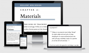
This week on The Snippet Show we’re going to take a quick look at fluid typography. Last week we featured Ethan Marcotte’s new site and while I was reviewing it for the site I noticed that there is some cool fluid typography scaling going on. It looks as though the approach is based on Made by Mikes article about fluid typography.
The font-size on Ethan’s site is declared as the following:
font-size: calc(14px + (16 - 14) * ((100vw - 300px) / (1400 - 300)));
To break this down in a few lines we have
- 14px as the minimum font size
- 16 as the largest, minus the smallest (14)
- We times that by 100VW minus the smallest screen size in mind for the 14px size, 300px
- Finally divide that by the largest screen width (1400) defined for 16px minus the smallest screen size again.
So if I wanted my font-size to be 16px on a screen at 320px wide, and 22px on a screen 1600px wide my declaration would be
font-size: calc(16px + (22 - 16) * ((100vw - 320px) / (1600 - 320)));
This gives you pixel perfect control at the places you want and complete responsiveness for any point in between.
Okay, let’s get linking.
Headline
Learning from Lego: A Step Forward in Modular Web Design
A few years back I did a talk that compared the CMS I worked with to a box of lego and played on the fact that if you could become a master builder you could create any web experience imaginable with the tools at your fingertips. This article, however, takes a look at the spacing between the dots on lego and their margins/borders. Samantha Zhang then uses the lego layout and applies it to a grid system in CSS. Very very cool.
Front-End Performance Checklist 2017
A wonderful checklist you can use next year to keep on top of your new and existing web projects. Vitaly provides us with a 33 point checklist of best practices to make sure you’re delivering something up to scratch.
Our Sponsor
Imagecon in downtown San Francisco!
Top experts are gathering to discuss the media challenges facing developers today. As the amount of images & videos on the web continues to grow, many challenges arise when trying to manage this vast amount of content. Learn best practices & meet your peers. Reserve Now.
Sponsor RWD Weekly and reach more than 28,120 responsive champions
Articles
Front-End Developers Are Information Architects Too
Francis Storr looks at how we can make our sites more accessible by ensuring our front-end is providing the correct hierarchy and access to the content even when using VoiceOver.
position:sticky is back in Chrome
Guess who’s back. Back again. Sticky’s back. Back again. Guess who’s back, guess who’s back, guess who’s back….
The (Not So) Secret Powers Of The Mobile Browser
Move over Native Apps, there’s a new kid in town. One of the coolest things in this article is the Sock website that uses <meta name=”theme-color” content=”#db5945″> to update the title bar colour to match the colour of the socks that you’re currently viewing. Ingenious.
Conversational Design Essentials: Tips For Building A Chatbot
Chatbots are just another way that people can access your content, another form of responsive design you could argue. There are situations where it is a suitable option, but equally there are times when it’s just not suitable.
Your Voice
Levelling up our client side developer experience
What we learnt from our mistakes in 2016
Tutorial
Installing the Google PageSpeed Module
A review on getting the Google Page Speed Module set up on either your Apache on NGINX server. It does some neat stuff like serve .webm images to supporting browsers and improve on a lot of the things that Google Page Speed online tester will look for. Remember that this does a lot of stuff automatically and you could do your site more harm, so make sure you configure the bits that make the most sense for your site.
Meet The Web, Worldwide
Tools
Font Face Observer
Font Face Observer is a fast and simple web font loader. You can use it to load fonts and customise your browser’s font loading behavior.
Pull to Refresh.js
Video
State of Responsive Design – with Ethan Marcotte and Karen McGrane
A conversation about the past, present, and future state of responsive web design with special guests Ethan Marcotte and Karen McGrane.
Nested Grids
Fearewell
That’s all for this week and this year! We’ll be back again in the new year with another bumper to bumper edition.
Happy Holidays!
Cheers,
Justin.


