RWD Weekly #208
Welcome to another week of responsive goodness!
I’m battling a bout of illness this week so lets get straight into the links while I get straight back into bed.
Baby update: still no baby yet.
Headline
BEMantic: DRY Like You Mean It
Last week we featured an article about ensuing your CSS is used along with semantics, for example styling button instead of .button in a <button class=”button”> example. This week our long time friend and contributor Matt Stow shows how both BEM and staying with HTML semantics
Our Sponsor
Get the Mega Bundle of 48 Vintage, Grunge Fonts
Merge the past with the present, thanks to this incredible dea! This mega bundle offers up 12 fantastic font families, all done in a retro, vintage and grunge style. Counting in a variety of different styles, you’ll take home 48 unique fonts in 1 super-discounted package! See the fonts here!
Articles
Archiving Our Online Communities
If you’re going to archive a site, this is how you do it
Let’s Write Beautiful CSS Comments
If you ignore our previous articles on being semantic with CSS or focussing upon a BEM approach (or both) the one thing that you should be doing but I’m almost sure you are not is leaving comments to explain your CSS. Sparkbox show how you can make your CSS so much more robust with these few tips
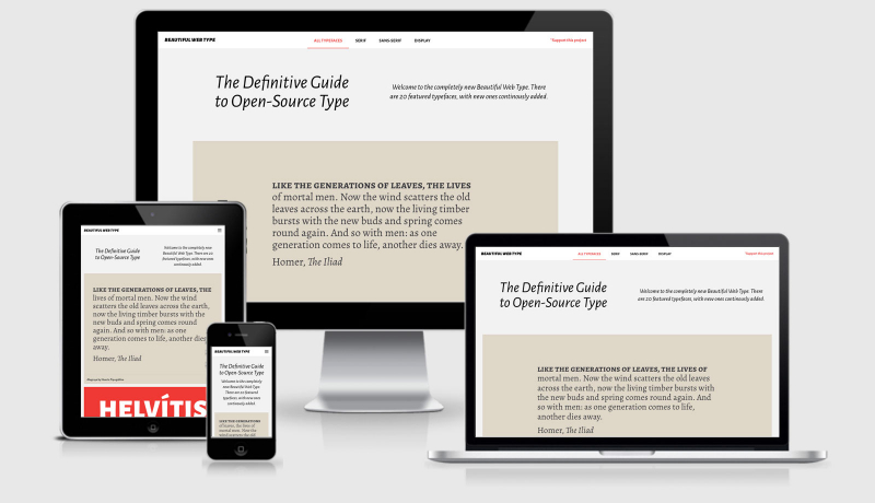
The Value of Multi-Typeface Design
A great article that looks at the benefits of multiple typefaces in design. This approach does include more weight to the page, but the argument is that it benefits the readability and consumption of the content. While 400kb of fonts is a little over what I would consider suitable, I’d rather that than a 400kb picture of someone eating a salad.
Optimizing for Large-Scale Displays
While most of us are now practicing the mobile first approach there tends to be an upper limit to the designs. Once we 1200px we tend to include a max-width to our main content column and let the margins do the rest. In this article we look at other approaches to ensure that the content is readable even across larger screens.
The Importance of !important: Forcing Immutability in CSS
So apparently now we can use !important…. I always knew I was ahead of the curve ;)
Reducing JPG File size
We originally covered some of these options back in 2014 but there’s some great tips on how to approach this a little easier.
Webfonts Last
Tutorials
Service Workers — Gotchas
Dealing with 3xx requests
The Sonos Pattern Library
An overview of how the Sonos pattern library came about, and how you can do sizeable things with fewer people
Content-First Prototyping
I’m all about content first as much as possible. As often as possible I work with Gather Content to capture this content but this is a great tutorial on how you get get going with excel and prototyping as well.
Truly Fluid Typography With vh And vw Units
Embracing fluid typography might be easier than you think. It has wide browser support, is simple to implement and can be achieved without losing control over many important aspects of design.
From HTML to ARIA Tabs, A Travelog
Presenting content hidden behind a tabbed interface is certainly on of the options when it comes to a changing viewport, the key is to keep the content accessible for everyone.
Tools & Resources
waybackpack
Download the entire Wayback Machine archive for a given URL.
Shots
pull down the entire Internet into a single animated gif
Death Star II
Code Pen example from our earlier article about large screens.
jQuery Custom Select Box Plugin
This lightweight, unintrusive technique uses the native select box functionality of the web browser, and overlays a stylable <span> element in order to acheive your desired look.
Font Face Observer
Font Face Observer is a fast and simple web font loader. You can use it to load fonts and customise your browser’s font loading behaviour.
Finally
Thanks for subscribing and I hope you managed to pick up a few new ideas and learned something new this week. If you’ve come across something of interest please share it with me by hitting reply and I’ll check it out for next week.
See you next Friday!
Cheers,
Justin.
 A notebook you'll actually carry every day.


