RWD Weekly #92
 A notebook you'll actually carry every day.
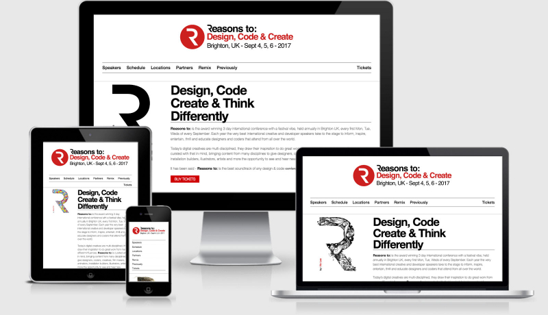
This week our feature site is our much loved hosting provider for the responsive design weekly website, MediaTemple. This week I created a quick overview of the responsive nature of their site and in the next few weeks I’ll be speaking with some of the front end crew about their approach and some of their decisions behind the build, can’t wait to share that!
Hello and welcome to another week of responsification… yes it’s real word*
The community recently took a step closer towards a responsive image solution after the <picture> approach was nearly cast aside before making an almighty comeback to lead the race.
There’s also a new workshop doing the rounds featuring a couple of people that know a thing or two about content and responsive design, but more about that later.
Lets get to those links.
*not really a real word
Headlines
Responsive Design Isn’t Good Enough
We’re not finished with a responsive redesign, you need to be developing a purpose driven website. A great post from James Stout at Ektron.
Defining Responsiveness
Jason puts the question of whatreallydenotes something as being responsive. This has similar connotations to “is it a web app or a website” debate.
// Sponsor
Start the New Year Right! Learn Responsive Web Design for Free!
This 12 lesson, self-paced course will teach you best practices for building responsive websites including: how to design using flexible grids; how to deploy fluid media, responsive images and responsive typography; optimal responsive web design workflows; and much more! Enroll now
Articles
Beyond Responsive
An excellent post follow up to Jasons article where Tim wonders if maybe we’ve been too successful and responsive design has taken on life as a buzzword.
The picture Element
After nearly suffering abandonment in the footnotes of history the picture element has risen again, this time as a draft.
Rounded by Gravity
An interesting read in making a website recreate the perfect book layout. It’s a great story of an idea, how it was implemented and the issues that were faced. I really love the layout across various viewports
A More Modern Scale for Web Typography
Maintaining a good typographic scale across many viewports can be difficult. Thankfully someone has done all the hardwork for us and created these set of new rules for a responsive approach (and someone even sassified them up too).
2014: The year we all go 4K
Dave Rupert ponders what it might mean if 4K monitors become mainstream. Does supporting displays that are 3840×2160 resolutions gives us Even Mo’ Pixels, Even Mo’ Problems?
Why We Dropped Zepto
Sometimes the fastest to load isn’t always the fastest overall performance. This was the case for Foundation and why Zurb made the decision to move on.
The Technology Behind the NYTimes.com Redesign
A look at what is new and what is improved in the NYTimes redesign. Rather then use css media queries they rely on their own responsive javascript solution.
What responsive web design means for team organisation
Ben Callahan looks at the business side of responsive design work and how that has had an effect on project teams and the clients we work for.
Bulletproof Accessible Icon Fonts
Icons can be a great way to convey meaning across smaller viewports. If your using icon fonts for social icons, three lines for menus, magnifying glass for search etc then you should understand the possible issues and solutions that come along with their use.
A Client-side Responsive Image Solution, Finally
I toyed with this idea in a huge twitter conversation a few months back. The consensus of the discussion was more that we were asking too much input from the user. This is a great solution for now, but we need to get browsers to allow these preferences to be set within the browsers so every site can benefit from these hints.
The Ethos of Responsive Design
An article that takes a step away from the technical side of responsive design. Focus on how your site/web app feels when you use it first, then look at the technical approach.
Guardian shows why mobile design has to work for commercial content as well as editorial content
A look at how advertising is framed between mobile and desktop viewports. In this example an obvious advertisement looks like part of the article in two viewports.
Tutorial
Responsive UI with Luminosity Level
Jordan first wrote about this in November, but Tomomi has taken it to the next level with a more detailed example. My friend Chris added this to his site too (open in Firefox and shield your light sensor).
Flexible CSS cover images
Resource
bootstrap-sass
For all of those Sass fans that always wanted a version of Bootstrap to play with…. this is your lucky day (well, Wednesday was your lucky day). Bootstrap has been officially ported to Sass and is now available on GitHub.
Tools
Responsive Tables Demo
A small plugin that detects when a table is about to break your layout. The table is then replaced with a link to view the table externally.
Workshops
Responsive Web Design: Workshops and training
Looking for some tips and tricks from some experts? Heard on Karen McGrane and Ethan Marcotte? You might want to check this out.
TIP OF THE WEEK: Organising your sass
Are you one of those people that love your CSS and take pride in crafting a CSS document? If so the chances are that you also haven’t taken the leap into CSS preprocessors because of this exact reason. My colleague Chris was one of those people until recently and is currently finding the delight that comes with scss over css. My one tip for him when he got started was to break up his Sass files into modules by creating _module.scss files, and to use a breakpoint mixin to write the media query changes to the module inline with the rest of the rules.
Chris is now much happier with life. If you want a little more direction on this then you’re in luck, I’ve elaborated a little more here.
This week I’m running a test talk through of the newsletter as a very short podcast.
It’s only 8 minutes long where I cover off a few interesting elements in this weeks newsletter. I’ll admit it, there was no preparation for this at all but if it’s something that a few of you enjoy make sure to reply and let me know and I’ll keep it up, I love getting you feedback.
Until next week!