RWD Weekly #259
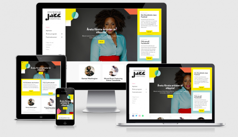
 A notebook you'll actually carry every day.
Welcome to RWD Weekly edition #259 and the first one that comes with an accompanying podcast for a long while. Speaking of podcasts, our good friend and web performance evangelist Henry Helvetica made an appearance on the other, and arguably far superior, RWD Podcast with Ethan Marcotte and Karen McGrane.
Alright then, let’s check out what we’ve got in this weeks snippet and then let’s get started with what’s happening this week in the world of front-end design and development.
Snippet Show
This week webkit has released the prefers-reduced-motion query which allows the user to specify if they want the animations removed (or toned way down).
Because animation is done through both CSS and Javascript you will need to make sure you provide a target through both. The first snippet here shows how you can do that via a CSS Media Query block
@media (prefers-reduced-motion) {
/* adjust motion of 'transition' or 'animation' properties */
}
but if you’re running your animation through Javascript then you’re going to want to use window.matchMedia
var motionQuery = matchMedia('(prefers-reduced-motion)');
function handleReduceMotionChanged() {
if (motionQuery.matches) {
/* adjust motion of 'transition' or 'animation' properties */
} else {
/* standard motion */
}
}
motionQuery.addListener(handleReduceMotionChanged);
handleReduceMotionChanged(); // trigger once on load if needed
I’ve been asked if this is worth implementing to which I reply “absolutely”. It’s important that we respect the choices of our users on their devices and this is something that will make or break the experience for someone who struggles with movement on the screen.
Sponsor

Snag the hottest new domain name for designers
.design domains have just been released, have you claimed yours yet? This week we have the opportunity to offer you a FREE .design domain name… no credit card even required. The code is unique, so if you’re forwarding this to a friend make sure you claim it for free before they do.
Did I mention it was free?
Articles
Financial Times increases engagement withpersonalisation, speed
Several months into the relaunch of the FT.com site the results are in…. faster websites are better for business (who would have thought!). Engagements are up, revenue is up, and more of the site is being viewed than ever before.
Design Better Data Tables
An animated example of different approaches for data tables. Tables aren’t a one size fits all approach, you need to make the most important data available for your users and at least one of these solutions should tick the box. My next job is to recreate all these examples as live code pen examples…. I’ll be back in a sec.
The Verge now defaults to HTTPS
Moving to HTTPS can be really hard, but if a site the size of The Verge can work on it (over a year) then so can you. Aside from the bonus of having a secure site for your visitors, switching to HTTPS means that you can take advantage of things like http2 and services workers for offline.
Media Queries Level 5
A couple weeks ago we had a newsletter all about Media Query Level 4 and while it is still in Draft format did you know there was a Level 5?
Making engaging VR experiences on the web
this is a beautiful step by step example on how to bring life to web experiences in general, but in particular focussing on the VR Web experience (but we’re all progressively enhancing right?)
The Workshop and the Storefront
Mobile Design Best Practices
Tutorials
Learn UX Design online, with an expert mentor. Build your portfolio
// Sponsored
Springboard’s self-paced course with 1-on-1 mentorship will help you understand users better & build products they love. BONUS: enrol now & get a 1 yr. subscription to Lynda.com, worth $240!
Having fun with physics and A-Frame
This is a pretty rad little demo in which you can set up and play tenpin bowling through your browser. Sure, you need a HTC Vive too… so now’s the perfect time to go shopping. Off you go, I’ll be here.
Some Extremely Handy `:nth-child` Recipes as Sass Mixins
I’ve been a big fan of :nth-child since I started using them to set repeating rows with unknown content and they just keep getting better. Have you got any useful ways that you use :nth-child selectors?
Simple Offline Website
I’ve been playing around with this awesome starter offline website that comes complete with a service worker. It’s even hosted up on Code Pen Projects so you can fork it and get started. (I forked it to make an offline football fixtures site and added a manifest.json file to add to homescreen).
Responsive Design for Motion
A great overview on how you can introduce one of the new media query recommendations — reduce motion (currently available in Webkit). This is where a user might choose to switch off animation effects, or ‘prefers reduced motion’… very common for a number of reasons (including medical reasons).
Learn CSS Grid – A Guide to Learning CSS Grid
This guide was created as a resource to help you better understand and learn Grid, and was organised in a way that Jonathan thought made the most sense when learning it.
Breaking Out With CSS Grid Layout
Last year Tyler came to the party with an approach to break out a full-width image away from our content container. Now he’s found a similar way to achieve this through the use of the new Grid CSS spec that’s taking the world by storm… or at least it certainly should be taking your world by storm.
Tools/Resources & Presentations
Archetype, Digital Typography Design Tool
Archetype helps you create a design system of consistent, reusable components which can be easily implemented as your finished design is exported as developer-friendly CSS so everyone’s happy!
Mavo
Mavo helps you turn your static HTML into reactive web applications without a single line of programming code and no server backend.
Articles, Links, and Tools From An Event Apart Boston 2017
This is like a mecca for links to awesome stuff from awesome people.
CSS and the First Meaningful Paint
If you’re trying to get better performance out of your website then I urge you to go out and buy your lunch tomorrow, put your headphones on, and listen to Patrick Haaman talk about what makes a fast website (and the tools you can use to test and improve them).
The In-Betweeners of Responsive Web Design
A great talk about the in-between devices bits that designers and developers can sometimes be guilty of not considering. I’m talking about the space between the 320 – 768 – 1024px breakpoints that are sometimes set.
Accessibility in a Responsive World
Scott Jehl is one of the smartest people in our industry, so when he does a new presentation I take lots of notes. Here are his own notes of his latest talk.
Finally
Finally, if you have written or read anything recently that you think others might be interested in then please send me an email back to let me know.
See you next week!
Cheers,
Justin.
p.s. I nearly forgot to mention that I’ll be speaking at the 2017 Adobe Max in October, if you’re going to be around I’d love to catch up for dinner or a beer.