RWD Weekly #263
Welcome to RWD Weekly edition #263.
Battling the flu this week so let’s just get into it.
Headline
What delayed my portfolio redesign for 3 years and how I finally launched it
If you’re thinking about redesigning your own portfolio (or building one) then here are some key areas you should be considering. Try not to go into it blindly (as we sometimes do with personal projects), have some goals in mind.
Firefox 54 finally goes multi-process, eight years after work began
And with this I think that my day to day browsing will switch over from Chrome to Firefox. I’m using Dev Tools in Canary at the moment because they’re awesome though.
Sponsor
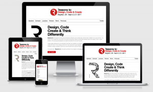
Reasons to: Design, Code & Create
Reasons to: is the award winning 3 day international conference with a festival vibe, held annually in Brighton UK, every first Mon, Tue, Weds of every September. Each year the very best international creative and developer speakers take to the stage to inform, inspire, entertain, thrill and educate designers and coders that attend from all over the world.
Use this link before July 1st to get 15% off your ticket.
Articles
The responsive order conflict for keyboard focus
Alastair points out the issue that we have with regards to tabbed order, source order, and the order in which we stack elements across a responsive interface. Alastair covers off the approach with actually updating the order of the elements when you have control over them, however, there’s an additional issue when you leave the placement of elements up to the Grid using auto placement.
Color Accessibility Workflows
Check out this awesome chapter excerpt from the very talented Geri Coady all about color accessibility workflows. It looks at A, AA, and AAA compliance for WCAG2.0 and covers a few of the tools that you can use in the design phase to ensure you’re not going down a path that you’ll eventually regret.
How Nathan Barry Turned ConvertKit Into an $8M+ Business in 4 Years
At the moment I don’t have any frustrations with Mailchimp because they’re great… however it turns out some people do. One of those people was Nathan Barry who fixed the issues he was having and has turned that into a very successful business.
Find Top Developers Fast //Sponsor
The search is over. Let Toptal connect you with the world’s most talented developers. Get started today.
Tutorials
CSS Grid Layout: A Cornucopia of Options
A great introduction to the CSS Grid with code examples from Jeremy Osborn at Aquent Gymnasium. They’re also re-releasing a responsive course soon so keep an eye out for that.
How I responsified my website’s typographic scale
While I was reading about the redesign of the portfolio above I saw the post on how the responsive typography was created. I love this approach of keeping the type responsive across all viewports instead of snapping at breakpoints.
An Introduction to the `fr` CSS unit
Last week we had Ida take us through some new CSS units, and this week we’re picking something from CSS Tricks that focusses entirely upon the `fr` unit.
The Equilateral Triangle of a Perfect Paragraph
This article covers off the importance of getting the three key components of a paragraph working in perfect harmony. Those are the line-length, line-height, and font-size. All three should form, as the title hints, an equilateral triangle.
Better Web Type – Triangle Game
There’s only a week left in this competition (following on from the previous link). There are so many reasons you should try it out as well… 1) You’ll get better at typesetting on the web, 2) you’ll identify where your most common mistakes are; 3) it’s a nice little interface with some lovely transitions that you’ll appreciate.
How to Optimize Images for Web and Performance
This article talks about the basics on image performance but also offers four different options for image plugins on WordPress.
Tools/Resources
Clippy
A wickedly awesome little online tool that will help you create some clip-path SVG’s and combine them with images to do some truly awesome designs. Tomorrow I’m spending the morning with our designers coming up with some cool uses of this.
Dos and don’ts on designing for accessibility
A set of accessibility posters that were released by the team at GOV.UK. They looked at a range of different accessibility issues including autism, screen readers, low vision, motor disability, hard of hearing and dyslexia.
Wing
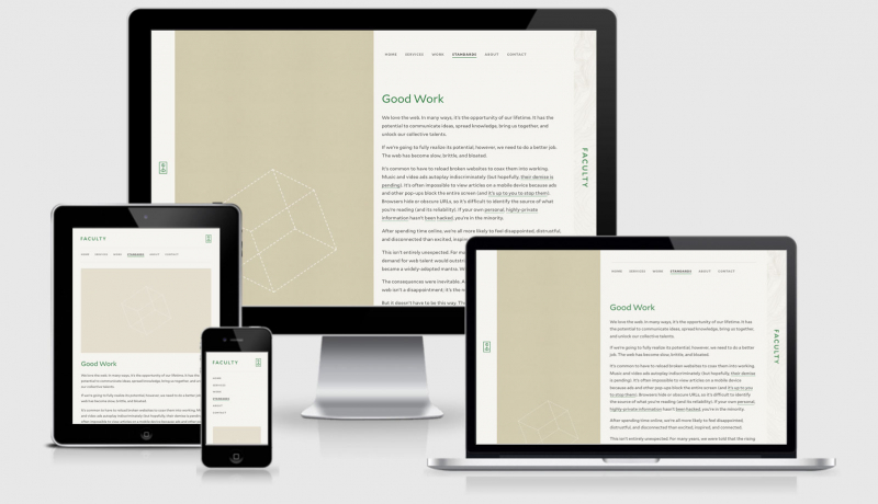
A beautiful CSS framework designed for minimalists.
Podcasts
Accessibility Posters — Responsive Web Design
If you liked the posters we included in the resources section this week then take 15 minutes out of your day and listen to the podcast they did with Ethan and Karen (not the posters…. but the team that created them. It’d be a long silent podcast with a couple of posters ;)
RWD Podcast 65 : Public speaking, Hololens, NBC Redesign
Last week I talked about a recent presentation course I attended along with a series of the most important links for the week.
Jobs
Software Engineer Intern Fall 2017
I’ve said it before and I’ll say it again… I love MailChimp! If you’re looking for your first position in the industry then why not throw your hat in the ring as a software engineer intern this fall?
Finally
This evening as I was writing this email I made myself a coffee and walked out into the backyard to get some fresh air (I’m battling a cold at the moment). Somehow I stepped on a bee who retaliated by stinging me on the underside of my big toe… OUCH! After a little swearing a spilling coffee over myself the incident reminded me of this cartoon. I too will never understand bees (but thanks for the honey and the cross-pollination stuff you’re doing).
See you next week!
Cheers,
Justin.
 A notebook you'll actually carry every day.


