RWD Weekly #380
Hello again and welcome to week 3809 of the RWD Weekly.
This week it is a bumper edition with some great tutorials and a lot of really valuable tools and resources.
Let’s get linking!
Article
Designing a focus style
When we get to testing accessibility on the sites we build we used to find that no one had applied focus rings properly, and often that someone had deliberately hidden them for the sake of the design. These days we include this as part of the designer requirements and this ticks two boxes: 1) the client knows they’re coming; 2) the front end team know how to style them. In this article Zell looks at some popular web development sites and how they handle the focus ring approach.
Feeling Sassy Again
Cloud four are moving back onto the Sass train after working primarily with PostCSS for the past couple of years. This article looks at their current approach and how CSS Variables might fit into the process as well. Tyler takes a good balanced view of these technologies and how their future stacks could be configured.
Why Progressive Web Apps Are The Future of Mobile Web [2019 Research]
Progressive Web Apps have been part of the conversation for a number of years, but have yet to be meaningfully adopted by most brands, which strikes us as a missed opportunity given the many benefits they possess.
Why is CSS so Weird?
This is a great watch. It doesn’t so much focus on the weirdness of CSS, but explains how the web came to be and why CSS works in the way it does.
Tutorial
Blog service workers and the chicken and the egg
Remy continues to tweak his implementation of his service worker. In this iteration he ensures that if you land directly on a blog post for the first visit (when the service worker is first activated) that the current page is added to the list of cached items (it doesn’t by default because when the page was requested the service worker hadn’t been installed yet).
Adaptive Photo Layout with Flexbox
17 lines of CSS. No JS. Basic markup. I love that going back 5 years this would have required jQuery and a separate library to get the same effect, and we’re now just punching this stuff out with standards. WOOP!
Complete Guide to Responsive Images!
If you’re still scratching your head about responsive i
What is a CDN? (As Explained to a 5 Year Old)
Finally, I understand… through the medium of pizza. I’ve been a huge fan of CDN’s (in particular Cloudflare) for a long time. If you’re not sure why it’s important, check out this article and bring your content closer to your readers.
Reverse Knockout Text Mask Effect with SVG
Using design tricks on headings allows you to make more of the typography choices that you make and can have some interesting design outcomes. This approach will work with both custom headers (like a homepage that you set and forget) but also with a blog/CMS that has variable heading lengths/sizes.
Building a Scrapbook Layout with CSS Grid
A compound grid is when you have two grids, like a 5 column and a 4 column, and you overlay them together. What does that have to do with Scrapbook layouts? Well this is the grid that Michelle used to build the scrapbook and she even built this little tool on code pen that will help develop them. I love the approach to this particular grid layout because Michelle employs CSS Variables to control the row track sizes. It might be a little confusing to start with, but take the time to understand what is happening here because it will open up a world of opportunity for your future web designs.
Text-To-Speech And Back Again With AWS (Part 2)
You can translate your blog post into audio using the link to part 1 in this tutorial, but you can also translate your speech into words in this week’s tutorial. I’ve tried this before and found that, with my Australian accent, it rarely works with enough accuracy. What I end up doing is using tools like rev.com that offer real people to transcribe and tidy up which provides a much better, yet more expensive, end product.
Inspired Design Decisions
More amazing inspiration for web layouts from Andy Clarke as he looks through the work of Bea Feitler and recreates these in CSS.
Tools, Resources, and Podcasts
A Modern CSS Reset
I remember when Eric Meyer created the first CSS reset back in 2008 (or at least that was the first time I really started using it). I think this version from Andy is a modern approach and something which is worth considering. If you’re using any reset please make sure you understand what the declarations are doing (Andy explains this) so that you’re clear on the decisions your making and how it impacts the rest of your styles
Devices
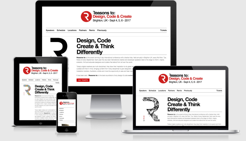
A bunch of different device images that you can use as part of your designs. I’m going to try and get an SVG version of these and replace the http://ami.responsivedesign.is site with them to reduce the load times.
Relearn CSS layout: Every Layout
Brought to you by the great minds of Heydon Pickering and Andy Bell, Every Layout is a site that will help you relearn the way in which you previously used CSS to build out particular layouts by using the new CSS capabilities like CSS Grid and Flexbox plus much more.
Introducing Prompts
I’ve been keeping up with Inktober so far this year and I’ve loved playing around with Dave’s tool. It’s an offline progressive web app that prompts you with the task for drawing, and then you can draw on a canvas using your device and save the image down. amazing.
Automated (and Guided!) Accessibility Audits with axe Pro
Our accessibility person is away next week and there is a project that needs to be reviewed. Thankfully, I came across this article (sponsored) on CSS tricks. I’ve signed up for the free beta and will be test accessibility for the week :)
Web Console Helpers
If you run
WebPonize
macOS app which converts images to WebP.
Button Contrast Checker
Enter your domain and we test if your buttons have enough contrast and are compliant with WCAG 2.1. The tool tests default, hover and focus.
Finally
Every Pixels is one animal
I love this design approach for showing endangered species by only including the same number of pixels in the image as there are estimated animals left.
That’s all for this week, see you again next Friday.
Cheers,
Justin.
 A notebook you'll actually carry every day.


