Hey everyone and welcome to week #386 of the responsive design weekly.This week we lead off with a monster of a report that dropped this week. The Web Almanac state of the web for 2019 which goes into all kinds of aspects of the web. This isn’t the only report that we’re looking at this week either, there’s also the annual front-end tools survey results to review.There’s also been this little event called the Chrome Dev summit which has uncovered some new performance tracking and much much more.Right, let’s get linking!
Headline
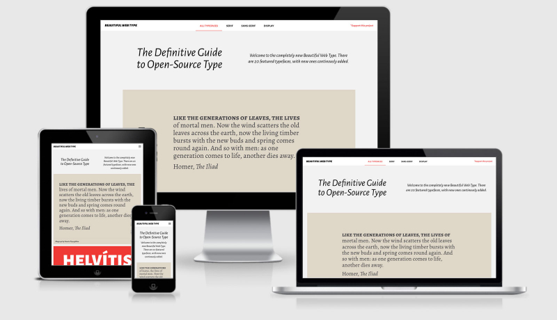
The 2019 Web Almanac
HTTP Archive’s annual state of the web report.
Sponsorship
Learn a New Skill in 5 Minutes with Gymnasium
Take 5 minutes to learn a practical skill with Gymnasium’s Take 5 video tutorials. Gymnasium is dropping a new video every day this month with a different theme each week — from web design to career development. What are you waiting for? Start learning!
Article
Thoughts After Looking at the Web Almanac’s Chapter on CSS
Chris takes a look the Web Almanac’s CSS Chapter written by Una Kravetz and pulls out some of the key facts he thought were interesting. We’ve included the link to the full Web Almanac back up in the top of the email if you haven’t already clicked and read it.
The Front-End Tooling Survey 2019 – Results
The results are in from 3005 developers answering 27 questions about how they use front-end tools. Ashley does this every year and it’s always interesting to see what the wider developer community is using year on year.
Get More For Less With Variable Fonts
I feel that most of us (certainly me) are still coming to grips with the application of variable fonts when we build sites. To me this means it’s up to us to become more familiar with how they work and the design potentials that they open up, and then showcase that to designers so that they can have it in their toolbox when designing interfaces. I also think that until variable fonts are a part of our design tools it will be a struggle.
Apple Is Trying to Kill Web Technology
Last week I talked about Edge having Chrome as it’s rendering engine (more or less) and that this is true for WebKit and any iOS browser. In this article Owen looks at the steps Apple are taking to literally remove as much web based technology from native apps as it can do. I’d like to think that is a performance based decision, but I feel it’s done for the same reason AMP pages get a free pass to the top of the Google results…. Apple are using their position in the market to force things to be built with their own tools.
Chromium Blog: Moving towards a faster web
The Google Chrome team are making UX changes to the browser to help users identify is a site is known to be slow loading. This is a great step in the right direction provided that they get the measurements right (which I’m sure they will). It’s great to see the Chrome team focussing specifically on performance as the key indicator for this, unlike the Search implementation that just looks at whether a page is AMP enabled. This is a great reason to revisit your sites performance because you can be sure that anyone that sees a “usually loads slow” message will be hitting the back button pretty quickly.
8 Unbelievable Things You Never Knew About Tracking
Really eye opening slides from Laura Kalbag’s recent talk at Full Frontal web conference in Brighton last Friday. If you think you know how much data is collected about you, I’m almost 100% sure you’ll find something else you didn’t know in this (I know I did)
#CSS :is() selector 🎉
The new :is() selector is a very interesting approach to writing CSS. The support for :is() isn’t great at the moment, but oh my isn’t CSS getting more and more interesting these days.
Chrome Developer Summit 2019: performance announcements you have to know
Calibre (a performance monitoring tool) go through all the announcements related to performance that happened during the Chrome Development Summit. They cover off some of the items we have in our resources section this week and much more.
The road to Brave 1.0
The Brave browser has turned v1.0, now is a great time to go download it and give it a go.
GSAP 3 Is Available Now!
For those of you that love your animations you probably have used or are using GreenSock. Well this week lots of things have changed (for the better) with their release of V3. This blog takes a look at some of the bigger and more impressive changes.
Tutorial
Cropping Images to a specific Aspect Ratio with JavaScript
In this 3 minute tutorial you will write a tiny JavaScript function that helps crop images to various aspect ratios. Super useful for cropping photos before posting to social media timelines or uploading profile pictures as these are often required to be of a certain aspect ratio.
Building a Custom Sound Board with Vue and IndexedDB
This seems so fun and simple that I feel like it’s going to be a weekend project with the kids so that they can make their own monster and — let’s face it — fart sounds.
How to minify JavaScript and CSS files using gulp
Minification (and gzipping) is a great approach to improving the performance of your website, and as we’ve showed already in this weeks newsletter page performance is increasingly more important. Kieran, who is an incredibly knowledgeable and super helpful member of the JavaScript course I’m doing, has this tutorial on using Gulp to take your CSS and JS and minify them so that the size of the file you’re serving to the browser is smaller, and therefore faster.
Variable Fonts, improved OpenType support, and a new Data plugin
Speaking of variable fonts in design tools…. as soon as I wrote the comments for the above link I went searching. It turns out that sketch did include its variable font capabilities back in October. Did you know that?
Understand Website Accessibility with the Firefox Accessibility Inspector
When building a website, understanding what’s happening with accessibility can help you make certain your site can be used by everyone. Firefox DevTools now has a new Accessibility Inspector that shows an outline of the accessibility tree, and lists problems with contrast or missing labels, and much more. Jen Simmons gives you a tour.
Oh Hey, Padding Percentage is Based on the Parent Element’s Width
Setting the padding as a percentage on a variable width element will allow the design to remain within a given ratio (think a flex element or a responsive element that might grown or shrink depending on the number of items in the list or the viewport width). It turns out that the percentage isn’t based on the element itself though, but instead the parent container the element is within. Huh, I did not know that.
Tools & Resources
HandBrake Upgrade
If you self host video on your site then I’m sure you’ve come across HandBrake before, and if not you really should. I used to use this to rip DVD’s I’d bought onto my computer to watch, and over the years I’ve continued to use it to compress video when required.
Metrics — Google’s Web Dev
This resource provides insights about the types of things that Google recommend you should be monitoring and reporting on for better website performance. More and more acronyms to get used to including FCP (first contentful paint), FID (first input delay), TBT (total blocking time) and more.
Finally
That’s all for this week. As always thank you to those that sent through link recommendations, if you’ve come across something or have written something please send it through.
See you again next Friday.Cheers,Justin.


 A notebook you'll actually carry every day.