Happy Friday and welcome to the 401st edition of RWD Weekly, and you’re more than authorised to enjoy it (only the start of the 400’s response code Dad jobs).
I’m sure your twitter list and news sites are full of stories about Covid-19. I’m sorry if you’re impacted in any serious way, but if it’s limited to working from home then there’s a few articles in this week that will provide tips on how to do that better (and some tutorials to do rather that commuting).
For now though, let’s get linking.
Sponsor
Navigation Pro Theme Package
Navigation Pro cuts through the haze with bright colors, bold images and versatile layouts to steer your site to success.
Launch fast with starter packs for Travel, Cuisine, Fitness, and Law, or use the included custom block sections to build pages that capture attention and turn visitors into customers.
Article
How to thrive working from home
For those of you that are going to be working from home over the next month or so due to COVID-19, here are a couple of resources to help you adjust into a new way of working. This covers the benefits, challenges, helpful tools and companies that have already made the switch (well before any virus reared its tiny virus head)
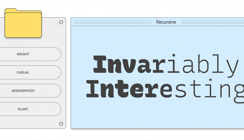
A Variable Fonts Primer
Welcome to the most radical change in type since Gutenberg. Variable fonts let you add nuance and artistry to your web typography without bogging down your site. Now you can accomplish what used to require several files with a single file and some CSS!
This site, made by the friends of Google Fonts, cover everything about Variable Fonts and show you how to get started. Google Fonts have even included variable fonts as one of the filter options on it’s own site. BEWARE though, make sure you also read the performance article (below) about Variable Fonts below and understand when to use them and when to stick with static fonts.
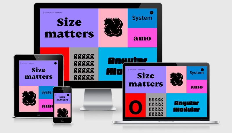
Variable fonts: Is the performance trade-off worth it?
Ann takes a look at the Roboto Variable Font compared against loading static versions of the Font to see which has the better performance. As with most things, it depends is really the answer, but this should make you think twice before automatically reaching for a variable font (and it helps you understand what you should be thinking twice about when doing so).
Tutorial
CSS Viewport Units
A great round up of what CSS Viewport Units can offer you along with a whole bunch of useful examples on how and when to implement them.
Setting Height And Width On Images Is Important Again
Please oh please, I can’t wait for aspect ratio’s to become a real proper supported thing. The approach of using aspect-ratio: attr(width) / attr(height); (thanks Jen and Fantasai) is exciting, and the prospect of this being added to the user-agent stylesheet would be even better, but I’m sure there’s some backwards compatible issues that’s sure to cause issues.
Designing web applications for the Apple Watch using Toucaan CSS Framework
Some tips and tricks about building for a watch first instead of mobile first. I’ve had a smart watch for three months now and can confidently say that I’d never browse or read articles on my watch, so keep in mind the form factor and how people will want to engage with your content through this medium (I’m a sample size of one, do your research ;) )
Tools
Lighthouse bookmarklet
Last week I mentioned the Google Lighthouse browser extension that you can get for Firefox, but this is even better. There were some issues with that extension running if you had Firefox popup blocker enabled (and why wouldn’t you), so Jeremy took a look and realised all you need is a bookmarklet. You drag the link at the bottom of the article into your bookmarks bar and voila, it works on Firefox (and any other browser I assume too).
Video
“Designing Intrinsic Layouts” by Jen Simmons
This week covered an article about adding widths and height back onto your images so that they get an aspect ratio and the browser doesn’t have to repaint the content when the image loads (and you don’t lose your place when reading as the image loads in). The whole aspect ratio is taken even further by Jen’s talk on Intrinsic layouts… will this be the next big thing in web design?
 A notebook you'll actually carry every day.