RWD Weekly #394
 A notebook you'll actually carry every day.
Hey everyone and welcome to Responsive Design Weekly #394.
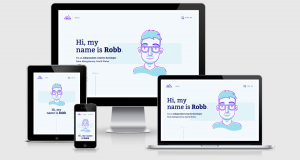
Our featured site of the week comes from Robb who has just released his brand new home on the interwebs. It’s a great site with some lovely usage of subtle animations, and the best thing is the homepage sneaks in at around 80kb. Yay for performance.
You can read more about how Robb put the site together, and then continue on down for the links this week!
Right, let’s get linking!
Article
Standards for Writing Accessibly
This week is a fantastic set of great tips from Michael and Andy around accessibility improvements for content editors, copy writers, designers and developers. One great example is when to put in password rules, it should go before the password field so you know what to do BEFORE you do it. Whether you’re sketching, wireframing, designing, building, QA-ing or writing… if you see that it isn’t the case then it’s your job to call it out and offer to fix it. Everyone is responsible for an accessible site.
This Page is Designed to Last: A Manifesto for Preserving Content on the Web
Some excellent recommendations in this article including going back to basics (HTML/CSS), reduce fonts, be obsessive about image compression, watch your uptime.
The CSS Cascade
A lovely designed page to showcase how CSS works. Have you ever wondered why one rule supersedes another in the same CSS file? This article will help you understand.
Some Imaginary CSS
What CSS could I be writing in a few years that might seem far-fetched today?
We’re Killing the Mobile Web
But with your careful help and direction on the projects that you’re working on we can bring it back. I sometimes can find these articles click baity, but there are some good lessons to remember like not pushing an app to download, be mobile first (really, not just a mobile version of the desktop design), and go easy on the JS.
Understanding the “Initial”, “Inherit” and “Unset” CSS Keywords
I’ve always had trouble properly grasping these CSS settings so it’s nice that Elad has been able to spell it out for us.
Tutorial
4 CSS layouts without using media queries
This is a nice post outlining a tweet I came across last week. Using flexbox, Adam was able to layout a form in 4 different ways with the same code block across multiple viewports.
A Complete Guide To WordPress Multisite
The wordpress multisite approach can be great if you’re working in an agency that provides landing pages for your clients, or if you’re working within an organisation that has lots of individual sites that you want to manage under the same CMS. There are a few limitations and better approaches to setting them up, luckily you’ve got Manish to take you through them.
Using responsive modifiers to control layout changes in your components
A new approach to the responsiveness of content-dependent components. While it requires JS to work properly there’s a good fallback.
Redesign: Scales and Hierarchy
Frank Chimero continues his open redesign blog series with looking at typographical scale (now that he’s picked two typefaces to go with). He looks at applying spacing, weight, color, size, typeface, and accent to create a heading that stands out.
CSS Grid Template Areas In Action
I really liked Grid Templates when I first came across them. It seemed to make sense that you would define areas with names, and the great thing is that from breakpoint to breakpoint you can leave your content assigned to the same name but change the positioning of those areas. Make sense? Well if not you can read this instead.
Tools and Resources
Draw all roads in a city at once
This is a fantastic little tool which will allow you to build out line maps of the town you live in (or the town you love). This link shows my little country village in the countryside.
Design System Checklist
An open-source checklist to help you plan, build and grow your design system.
Lightning-Fast Web Performance
I’m really excited about this online video course coming up from Scott Jehl. I have a feeling that this is going to be the next “Building Faster Websites” from Steve Sauders all those years ago.
Browser Default Styles
This tool allows you to search for an element and see the default styles applied by browsers (standard styles, plus differences in the browsers). It would be great to see an improvement in the search, while ‘ul’ brought back what I was after, the term ‘unordered’ returned nothing.