RWD Weekly #412 Interview Series with Rachel Andrew
Hello and welcome to RWD Weekly Newsletter edition #412 and the final installment of the second interview series.
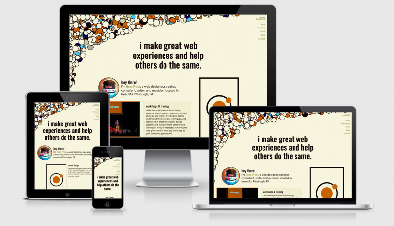
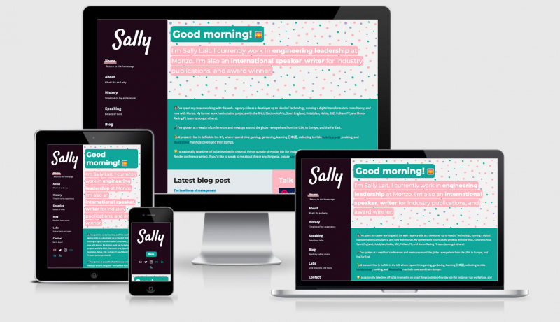
So far we’ve spoken to Stephanie, Kristopher, Sally, Chris, Ethan, Ire, and Brad — and now I’m excited to finish the series with Rachel Andrew.
Rachel is one of those people that continue to contribute to the web community year after year. Many of you will be familiar with her work around the CSS Grid specification and producing the best overviews and detailed explanations (like this free resource Grid by Example and these paid courses).
Rachel has two digital products, Perch CMS and Notist, is a member of the CSS Working Group, and is also the Editor in Chief of Smashing Magazine.
I don’t know how she was able to find time to answer these questions, but I’m sure grateful that she did.
So much has changed since Ethan’s eureka moment, what are your go to implementation methods for responsive sites? How do you handle layout, typography, images, video etc?
RWD with floats for layout was actually really hard. We have to figure out how big everything was, and then at different breakpoints do it all again. Get it wrong and things ended up in weird places.
So the thing that has really changed is that CSS has evolved to support a responsive web. Flexbox, Grid, Multicol all offer flexibility by default, in different ways. And, to a certain level responsiveness built in. You don’t need to use a media query to create a card layout for example, with as many cards that will fit in a row of a certain width. We can get the browser to deal with a lot of the calculations, rather than us have to do it and then redo it for different breakpoints.
Then we’ve got various ways of doing sizing, viewport units, fit-content() for grid tracks. We’re able to let the content dictate sizing within parameters, rather than having to force everything into percentage sized boxes. That’s really exciting.
We’re also realising that screen width is a bit of a rough way to figure out the capabilities of a device. So the media queries spec is now describing a bunch of media features – can my visitor hover? What kind of pointer do they have? This information is really useful in terms of being able to tailor environments to best suit individual visitors.
What are the top three issues you’re still facing when building a responsive site?
Lack of subgrid for Grid Layout, I think subgrid is going to solve a whole class of issues that we have, as we’ll be able to use our sizing down through components. We’ve got subgrid in Firefox, so we’re waiting for Chrome and Safari to follow.
Another soon to be solved problem is a proper way to define aspect ratio for things, so we can lose the padding hack, easily have a grid of square boxes and so on.
I think one of the biggest issues though is the content reordering issue that we have if we want to start really moving things around with grid layout. It’s very easy to disconnect the logical and visual order of things which can cause accessibility issues. We really need to solve that in some way, as I feel when teaching grid I have to constantly be warning people of this issue. We’re giving people the tools but then saying not to use them!
As a business/product owner, what is the most frustrating thing you find trying to take a product out across today’s diverse device landscape?
I don’t find it frustrating. It is easier today than it ever has been to build things that work well for everyone. I’m generally just amazed at what is possible now!
Prediction time. What are we going to see towards the end of 2020 and into 2021?
We already have some of the things I have mentioned above implemented in one or another browser, so hopefully we’ll see subgrid ship in more browsers for example. I think with the big pieces of grid and flexbox in place there are a bunch of new problems falling out of people using those. My feeling is we’ll be picking those off for a while. Probably no big thing like grid, but lots of smaller things that currently cause friction.
As someone who works on CSS specifications I’m sure you hear a lot of community (twitter) noise about how certain features should work and what should be worked on next.
How can those folks get involved with the CSS specification direction and contribute towards making CSS better?
To get new CSS features then two things need to happen, the feature needs to be specified – which is what the CSS Working Group do – and browsers need to implement it. Therefore if there is some use case that you have that CSS doesn’t do at all yet, the best place to raise it as at the CSS Working Group repo. You can raise issues here: https://github.com/w3c/csswg-drafts/issues
It’s worth searching to see if your issue has already been raised, as then you can add your use case as extra information, but don’t worry too much if you end up creating a duplicate, someone will spot it and reference your issue in the existing one.
Things can take a while to be discussed, if you are lucky your issue will touch on something already been worked on and so might come up for discussion quite quickly. Otherwise it is likely that someone will tag the issue with relevant specs, or maybe ask a few clarifying questions and then it will go silent for a while. However issues are not just closed, and at some point it is likely to come up for discussion.
If you are keen to offer feedback on things happening right now then there are a few of us who often post about discussions that are happening or specific information that the CSS Working Group want to know. For example I recently posted about Masonry https://rachelandrew.co.uk/archives/2020/05/05/does-masonry-belong-in-the-css-grid-specification/. The CSS Working Group works in the open, so our discussions are minuted and you’ll find the latest ones here https://www.w3.org/blog/CSS/. In addition, when an issue that is on GitHub is discussed, minutes will be posted to that issue. Therefore you can follow specific issues on GitHub if you want to see when they are discussed.
The group is always very keen to know what web developers are interested in. The process can seem to move very slowly at times, but that’s because once web platform features get into the wild we can’t take them back. It’s better to take care when creating them, in order that what we end up with works well now and into the future.
The second place where you can help to get new things implemented is where we have a spec, but one or more browsers haven’t implemented that feature yet. In that case you need to show browser vendors what you want. If there is an active bug on a browser bugtracker, you can go star that issue to show you are interested. You can also talk and write about the feature, thus demonstrating there is developer interest. Also, using features is important. If you can use a feature as an enhancement do so, that demonstrates that people are starting to use something, therefore making it more likely it will be implemented. If you look on Chrome Status, you can see the adoption of features https://www.chromestatus.com/metrics/css/popularity, this is something that browser vendors are aware of, making it really helpful if people start enhancing their layouts with subgrid for example!
Browsers are businesses, and like every other product have to prioritize what they do. By showing that there is a need for something, you can help with those priorities.
Thank you so much for your time, if our readers want to learn more from you where can they track you down?
I’m on Twitter and other places as @rachelandrew, my website is https://rachelandrew.co.uk.
 A notebook you'll actually carry every day.


