RWD Weekly #420
Hello and welcome to RWD Weekly Newsletter edition 420.
This week I was very happy to pick up an iPad Pro and I’m testing it out in the creation of this newsletter. The last tablet I got was 6 years ago when I got one of the original iPad mini’s, and while it’s still going strong it has been such a massive jump to the pro.
I ended up going with he 12.9” version with the idea that it would become a replacement for a laptop. So far, it’s coming along nicely for 90% of the work that I do, but for the price of a new laptop I’d expect just as much. I’ll keep a running overview of how it goes for anyone that is thinking about switching, but so far it’s one of the best tech purchases I’ve made.
Changing gears, let’s see what http status code 420 has for us this week.
It seems like we’re back in the Tea Pot territory again as there’s no real official status code. Twitter, however, took advantage of this missing code in their first iteration of their API and returned 420: Enhance Your Calm for whenever client requests were being rate limited. Technically, they should be using code 429 for too many requests… but that is hardly as much fun now is it?
Let’s get into our links, But first, let’s take a look at our sponsor this week and see what our good friend Ethan Marcotte has been up to lately.
Sponsor
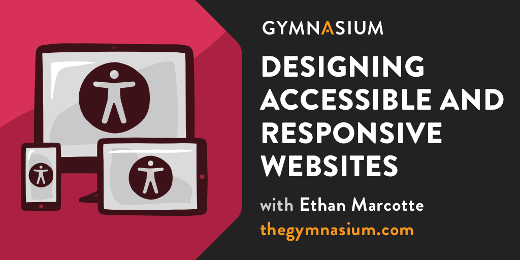
New! Free Accessibility Course
It’s our job as designers to make the web work for everyone — and this new course Designing Accessible and Responsive Websites with Ethan Marcotte is a great way to get started.
In the time it takes to step away for lunch, learn a handful of best practices to help make a more inclusive web. Plus, earn a badge to share on social media when you pass the final exam.
Article
The Guide to Design
A free, self-guided class to help you take your first steps into digital product design. The website naturally is a great design which is why it is also our feature site for the week too.
4 Design Patterns That Violate “Back” Button Expectations – 59% of Sites Get It Wrong
The Baymard Institute has produced a very long article which looks at four key areas where we tend to get things wrong and break the user’s expectations about what will happen when they click on the back button. None of it is theory either, this is taken from a bunch of tests and video was taken of the screen as well as the user’s interaction with the device so you can see how some decisions that we make (or choose not to think about) cause issues in the real world.
Responding to Crisis: Web Performance Style
This is a great article from Doug Sillars as he looks at all the imagery that has been created and used on websites with the keyword of COVID as well as images used on websites that contained the keyword of COVID in the domain name. If you think we have an image size problem now, just wait until there’s a global pandemic (oh wait…). This is most likely due to people who don’t have the technical skills rushing to share information with the wider public, which is great until the wider public can’t access the content because the page is too slow or they can’t afford the data plan.
Tutorials
How to Improve Largest Contentful Paint (LCP) and SEO
By optimising your images on your site you can go a long way to improving the impact of LCP on your site. With Google’s move towards using LCP as part of their new Web Vitals scoring system and impacting upon SEO it’s another good reason to optimise your images (as if optimising them to improve your user’s experience wasn’t enough).
WordPress-Powered Landing Pages on a Totally Different Site via Cloudflare Workers
I was listening to the Shop Talk Show podcast a couple of weeks ago on a run (it helps distract me from how unfit I am) and Chris was talking about utilising CloudFlare workers to bypass the need to use AJAX to pull in content. The idea is that the work is done on the CloudFlare Edge rather than the users browsers, which means performance is a first-class citizen and there’s no risk in the JS not running on the client browser. Did I mention it was super performant too?
Modern CSS Techniques To Improve Legibility
There are some nice tips in here around making the words on your website easier to read through better typography decisions. There were two approaches that I wasn’t aware of in the past, both things that I tried to do (like making sure the fallback font didn’t cause a huge layout shift while the font was loading) but not in the way that is approached in this tutorial.
The Designer’s Guide to Letter-Spacing
How to Make a Monthly Calendar With Real Data
Tools, Resources and Specs
CSS Vocabulary
Extension Spotlight: SponsorBlock for YouTube
Do you get frustrated when watching a video on YouTube only for an Ad to appear just as they’re getting to the good bit? Me too. This Firefox plugin helps with that by keeping the ads out.
Wiki.js
The most powerful and extensible open-source Wiki software. Make documentation a joy to write using Wiki.js’s beautiful and intuitive interface!
Never-Consent
It’s rare these days that you don’t get a GDPR Cookie pop up when you’re visiting a site. It creates an unnecessary step for most users to click at least once to dismiss this and get on with what you were trying to do. This browser extension handles this all for you by automatically saying NO to any of the opt-in options.
Media Queries Level 4
Finally
That’s all for this week. As always thank you to those that sent through link recommendations, if you’ve come across something or have written something please send it through.
Cheers,
Justin.
 A notebook you'll actually carry every day.

