RWD Weekly #426
Hello and welcome to RWD weekly newsletter number 426.
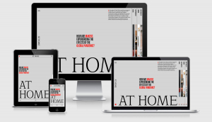
Our feature image this week comes from a different style of a site then I’m used to seeing. The vertical bars on the right of the larger viewports open up and provide a horizontal rather than a vertical scrolling site. Jordan Moore did something similar to his site this year and it’s something I think we’ll see more of as touch devices become more and more the norm.
I haven’t got any further on the IDE on digital ocean however thank you to all those that sent through your ideas on getting it up and running, and for those looking to do the same thing yes there will be a detailed tutorial that follows once it’s up and running.
Let’s get linking.
Sponsor
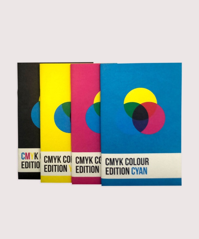
Colour Theory Pocket Notebooks
This set of colour theory pocket notebooks pays respect to the CMYK colour that I’ve become accustomed to after switching from an RGB digital world into the print world.
There are four notebooks in this set, one for each of the colours in CMYK.
The inside covers in this set showcase a range of aspects in colour theory including a colour wheel, colour mixtures, the emotional connection each colour makes and the theory of colour matching.
Article
Make Me Think
I really like the sentiment of this article. If you make things so easy for people that they don’t have to think then….. well then they won’t think. When you don’t think you make mistakes. You miss things. Sometimes increasing the cognitive load can provide better results.
Comparing Browsers for Responsive Design
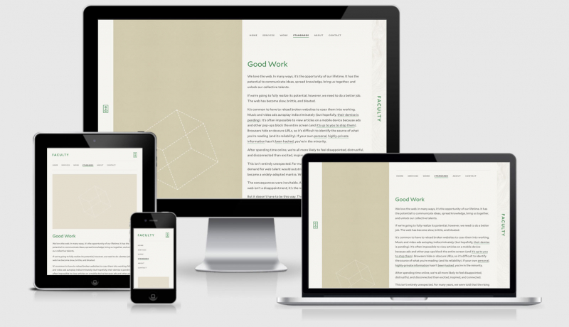
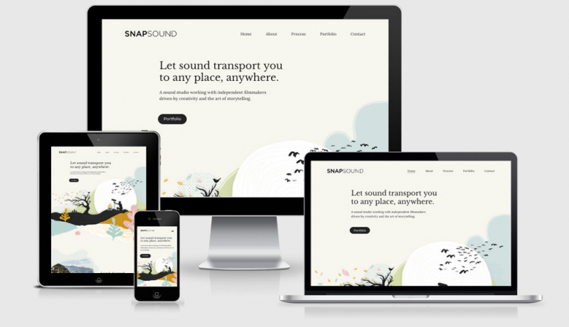
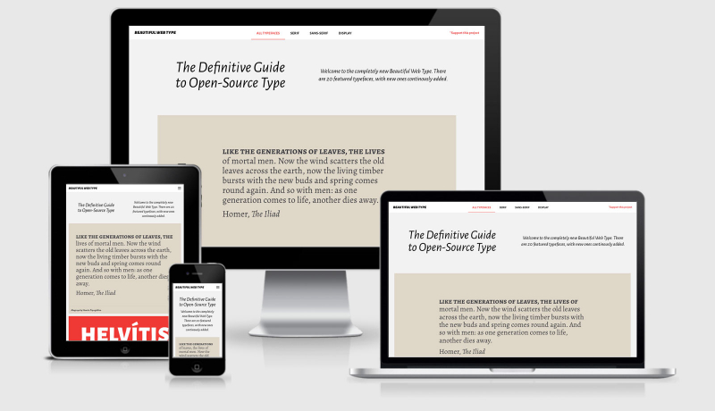
When I built Am I Responsive it was done for two reasons. First, so that I wouldn’t have to spend time arranging the feature images in these newsletters every week (probably 200+ hours saved there already), and secondly so that I could quickly illustrate to clients what responsive design meant. I’m glad it was picked up and used a lot, but these tools that Chris reviews this week are MUCH better when it comes to testing your responsive builds. Having said that, what’s the chances that you don’t already own a high-end feature phone, a laptop and a second monitor… you should always do testing on devices where you can.
How Fast Should Your Load?
A seemingly simple question with many layers. Is 2 seconds fast enough, or is 5 seconds okay too? Are we talking about first paint, page interactive? This article looks at the areas you should consider when setting your budgets/targets.
Font Smoothing in Edge
While this article is specifically about changing settings on Windows itself, I thought it was a good illustration of how fonts look different across different machines, operating systems, and browsers. Always test your site in browsers and computers other than the one you develop on because you’re probably building the site for others, not just yourself.
Tutorials
Building Website Headers with CSS Flexbox
Ahmad looks at the different approaches for laying out headers using modern day tools. It’s not all flexbox though, he has an occasion where he still reaches for floats. Because, it seems, that there are many many different ways to create a header he has decided to provide you with a resource of 17 different header layouts with subtle differences that should cover just about every scenario you can have.
Monitor Site Speed
Leverage the Chrome User Experience Report and Google Apps Script to monitor your site’s page speed.
Styling Complex Labels
This is a stylish approach from Cloudfour to turn form labels with complex information into really easy to understand choices… while still remaining semantic.
Excluding Emojis From Transparent Text Clipping
Ignoring the whole emoji exclusion, when did CSS tricks get these awesome hover links?
Tools & Plugins
umami
Umami is a simple, easy to use, self-hosted web analytics solution. The goal is to provide you with a friendlier, privacy-focused alternative to Google Analytics and a free, open-sourced alternative to paid solutions.
ztext.js
Easy to implement, 3D typography for the web. Works with every font.
Workshape.io – Talent matching for tech startups
A colleague at work pointed this site out to me this week. We were trying to find good tools for employers looking for tech talent and this seemed to be more candidate focussed (which is a great thing). I particularly liked how you can specify the types of areas you’re more interested in in the spider diagram.
I’m interested to know if any of you have used this before to get a job and how it went.
Finally
That’s all for this week. If you’ve come across any interesting/helpful articles or you’ve written something yourself please hit reply and let me know about them.
See you all next week!
Have a great weekend!
Cheers,
Justin.
 A notebook you'll actually carry every day.
