RWD Weekly #458
Hello again, welcome back to RWD Weekly #458, happy Friday!
This week we launched a new landing page for our product and it was my first real exposure to Tailwind and NextJs. It was funny when tweaks came back from the team asking to set content width to 30ch, or to change the padding to 8px because that’s how I would have done feedback in the browser as well… but when it comes to Tailwind you have to take that requirement and mentally change it to the tailwind alternative.
As a component-based thing on a distributed team though, it works.
A Look at Tailwind CSS
This week Ahmad digs into his experiences on Tailwind… and when Ahmad speaks about CSS it’s certainly worth paying attention to.
The Conference Platform We Use For Our Online Events
When we were all resigned to the inside of our homes as the pandemic took a grip of the world as we know it, our conference organisers didn’t give up their quest to put on a show. Without travel though, they turned towards online conferences and ways in which they could improve upon personal attendance. Although the technology used isn’t what makes the conference work, its capabilities does go a way to providing boundaries. Here, Smashing talk about their journey with Hopin.
Sponsor

Let’s Keep Evolving Together
Gymnasium just dropped four design systems courses with Ethan Marcotte tailored for designers, developers, and product managers.
Not sure where to start? Don’t sweat it — there’s a course for everyone.
Article
Debugging vertical layouts in 2021
A few years ago I looked at doing a vertical site the scrolled horizontally to replicate Eastern reading directions… it did not go well. I wish I had this article from Hui Jing to help work out where things were going wrong.
Pixelhop new website walk through
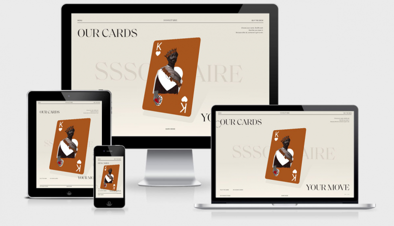
Not only is this our feature site for the week, but I really liked the walk through of the new site rebranding and interesting animations and functions they site has. I’m looking forward to the puppeteer and Cloudinary post for the social posts.
Web Accessibility for Newbies
Introductory information and advice on how to think about and approach web accessibility.
Cloudflare Pages and Workers
David looks at using the new Cloudflare pages as an alternative to replace Netlify. Having been a fan of Cloudflare since they started, and a recent heavy user of Netlify I was interested in the new approach. While it seems like Cloudflare have the same end product, the UX on how to get there is still much more favoured towards Netlify.
Tutorials
A Primer On CSS Container Queries
Stephanie Eckles covers off not just the way in which CSS Container queries are put together but also how they might fit within the larger CSS Grid layout.
Component-level art direction with CSS Container Queries
Container Queries (CQ) allow us to change the styles of a component so it responds to the size of its nearest container. With CQ, we can change how an element looks based on where on a page it is placed and how much horizontal space it occupies. Take a look through this article from Sara, along with some great examples of how card components can re-flow based on their containers.
CSS Full-Bleed Scroll-Snapping Carousel
Building a full bleed scroll snapping carousel with Bramus, complete with Code pen example.
Resources & Tools
Bootstarters – free templates for Bootstrap 5
- Free for commercial & personal use (MIT)
- Styled in accordance with Material Design 2.0 guidelines
- Built with the latest Bootstrap 5
Can I email…
If you’re familiar with Can I Use for browser support on new web features then you can probably guess what information/purpose this site provides.
 A notebook you'll actually carry every day.


