Curator
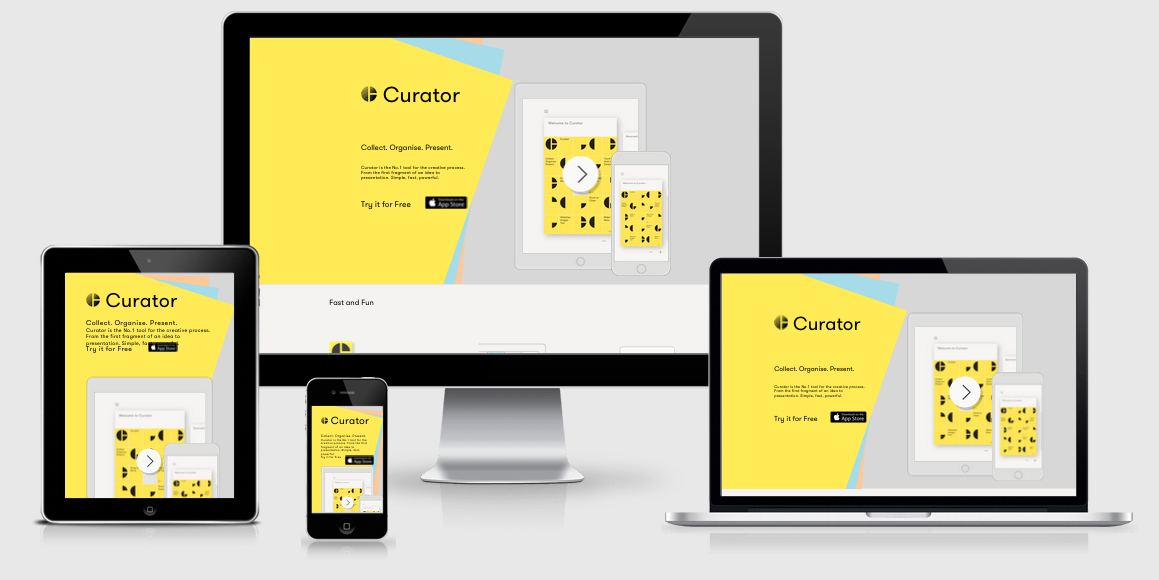
Curator is an app designed for the iOS family to allow you to curate stories for newsletters and social.
Disappointingly the meta viewport is set in an non-friendly accessible way. maximum-scale=1.0,user-scalable=no means that if you need to zoom you can not.
WordPress is the CMS being used which, while it is a popular CMS, has some negative typical implementations. In this case for each different plugin that is used a new CSS and JS file is linked out of the head, so there’s around 15 http requests before you get to the body tag.
In fact on this site both jQuery 1.11.2 and jQuery 2.1.0 are loaded in along with a number of other jQuery plugins.
There are a few JS functions that are sniffing specifically for the user agents (iPod|iPhone|iPad), which is great for iOS users but not so good for those on Android although to be fair it is for an iOS App so it’s arguably fine.
Rather than include all the CSS within a single CSS file and include media queries inline each CSS file is split out separately in link tags and media queries are used to load the required CSS. While this does mean less overall kb loaded for the CSS it means more http requests which is more costly
in this case.
They do include Retina.js to provide high resolution images, though it would be suggested they could be using srcset instead as it’s supported across all iOS devices (which seems to be the target market).
Curator Technical Details
Site Meta Tag
<meta name="viewport" content="width=device-width,height=device-height,initial-scale=1.0,maximum-scale=1.0,user-scalable=no" />Media Queries
<link rel="stylesheet" href="style.min.css" type="text/css" media="screen" />
<link rel="stylesheet" href="style-large.min.css" type="text/css" media="screen and (min-width: 770px)" />
<link rel='stylesheet' href='style-medium.min.css' media='screen and (min-width: 641px) and (max-width: 769px)' />
<link rel='stylesheet' href='style-small.min.css' media='screen and (max-width: 640px)' />
<link rel="stylesheet" href="style-font.min.css" type="text/css" media="screen" />
<link rel="stylesheet" href="js/shadowbox/shadowbox.css" type="text/css" media="screen" />
 A notebook you'll actually carry every day.