Get Fabrik
Get Fabrik is an online portfolio website for designers and artists to produce their own beautiful sites without having to worry about how to build websites.
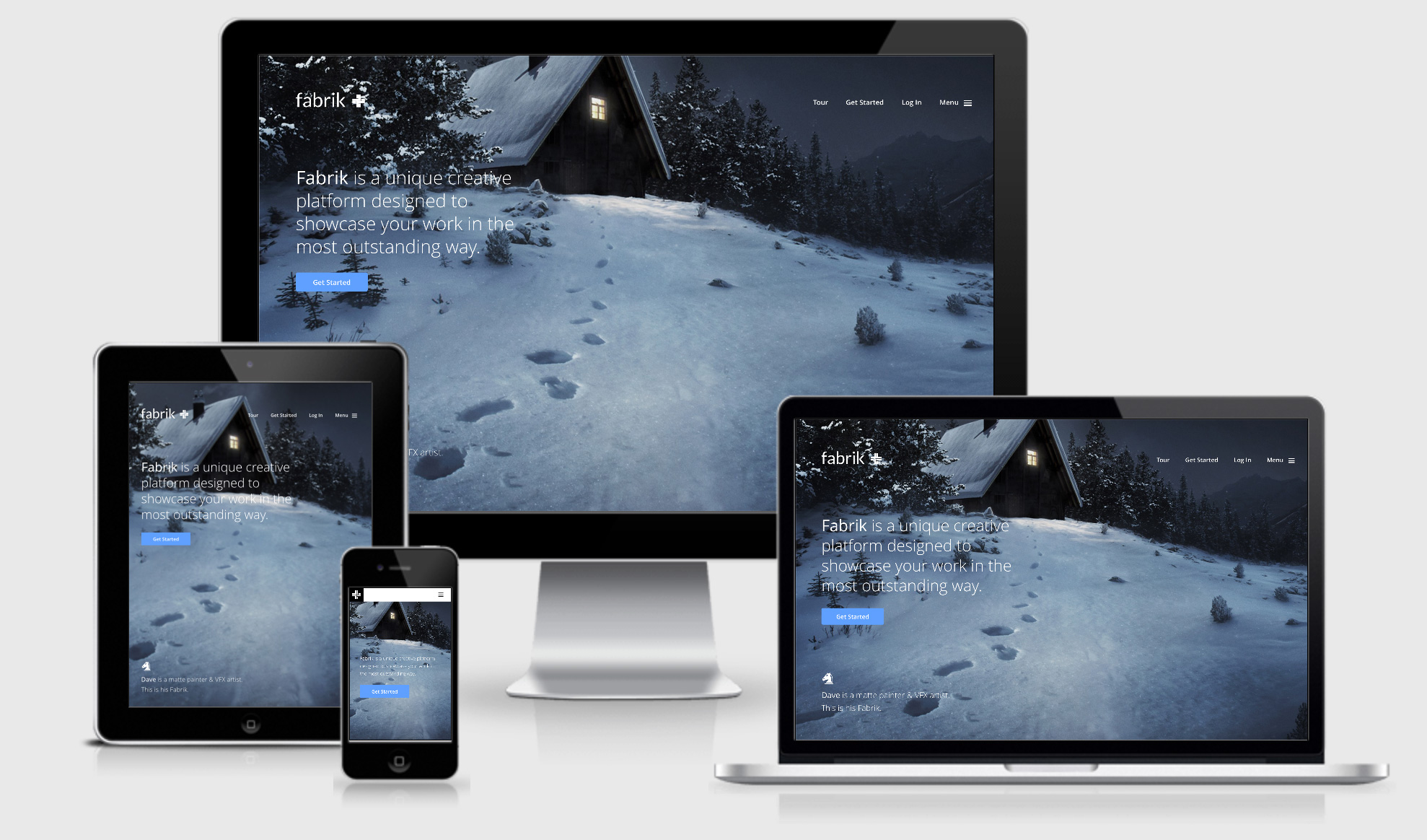
There’s no responsive image solution to speak of, which is strange because they have quite a heavy use of large beautiful imagery across the site (and I can only assume the same markup is used for the portfolio sites you create).
The media queries are all focussed on EM’s, which I think is great, but there are two based on pixels which seems a little strange (although they are focussed on orientation, height and really large screens).
They use Embed.ly on the site, something which I haven’t previously come across, and they also use Enquire.js which allows you to tie some javascript functions on the current viewport width.
Get Fabrik Technical Details
Site Meta Tag
<meta name="viewport" content="width=device-width, initial-scale=1, user-scalable=0, minimum-scale=1.0, maximum-scale=1.0" />Media Queries
@media all and (max-width:39.9375em){ }
@media all and (min-width:40em){ }
@media all and (max-width:79.9375em){ }
@media all and (min-width:80em){ }
@media all and (min-width:40em) and (max-width:79.9375em){ }
@media all and (min-width:1680px){ }
@media screen and (max-width:800px) and (orientation:landscape),screen and (max-height:300px){ }
 A notebook you'll actually carry every day.
