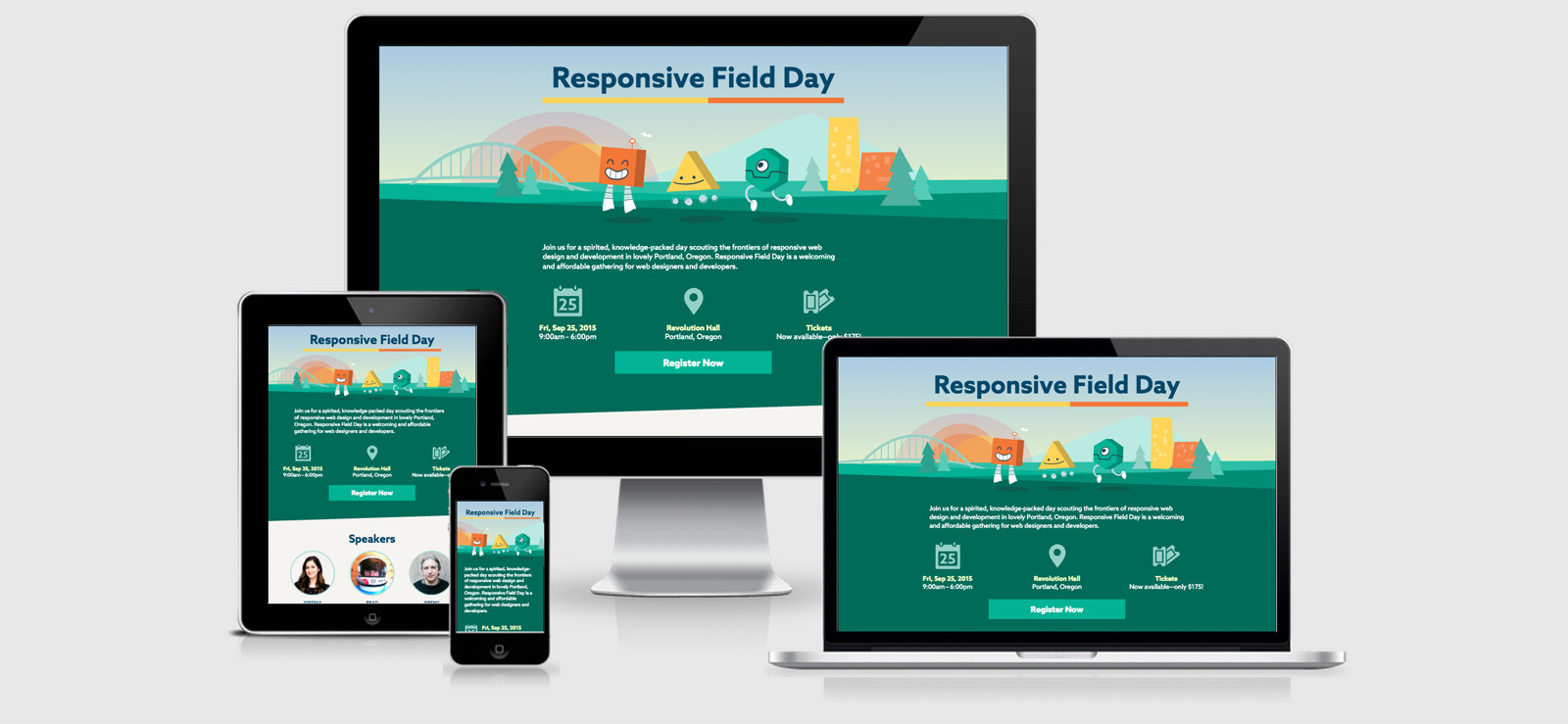
Responsive Field Day

This event site comes from the very clever folks at Cloud 4. Coming from this amazing team you would expect it to be a pretty awesome implementation using SVG where they needed to and either the SRCSET or PICTURE implementations. They did not disappoint.
The Picture element is used to target browsers that support SVG with a fallback img tag for PNGs, while the SRCSET is used for the speaker bio pictures to make sure they look as gorgeous on the page as they do in person.
They’re using a Grid Framework that I haven’t come across before, Suit CSS.
They also did very well to concatenate all of the Javascript into a single file. Within that file they’re running
- Custom Modernizr with support checks for inlinesvg-svg-shiv-cssclasses-load
- Picture Fill
The CSS is beautifully crafted with lots and LOTS of comments to indicate why each element was used. You could look at this as being lazy and not removing it, but I like to look at it like it would be a fantastic learning example for anyone getting into writing CSS to see why particular rules are included and where.
The downside to the CSS and JS included within here is that they’re not compressed so carry a few extra bytes along the way with them. In this case I would argue that it’s a learning resource rather than look at it negatively.
Finally I would add that on such a small site with so few CSS rules you could almost get away with inlining all of them… or at the very least inline the ones to achieve the now favoured Critical CSS approach.
Responsive Field Day Technical Details
Site Meta Tag
<meta name="viewport" content="width=device-width, initial-scale=1">Media Queries
@media (min-width: 39.125em) { }

@media (min-width: 30em) { }

@media (max-width: 39.0625em) { }

@media (min-width: 39.125em) { }

@media (min-width: 60em) { }

@media (min-width: 75em) { }
 A notebook you'll actually carry every day.

