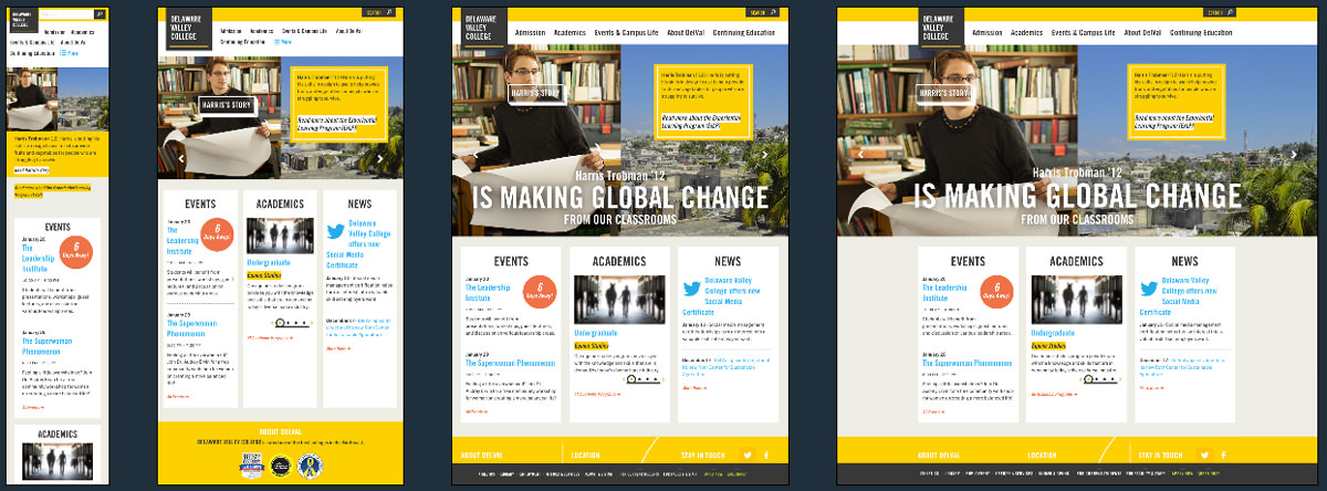
Delaware Valley College
There are three @imports in the CSS for social, standard and royal slider CSS rules.
The media queries in this CSS pop up everywhere. There are multiple uses of the same media query which usually points to the use of SASS or LESS when writing the CSS. There is a good use of vertical media queries which specifically target the home page slider, looking at the height in increments
of 50px and readjusting the max width of the element accordingly.
They have implemented http://www.sequencejs.com/ as their slider, something which up until we saw this site didn’t realise existed.At the time we were reviewing the site the inner menu wasn’t working, but we sent a note off to Happy Cog to see if that could get fixed up.
There are a couple of funky things being done around the Logo and the carousel as well.
<strong class="logo">
<a href="/">
<span data-picture="" data-alt="Delaware Valley College">
<span data-src="/a/i/logo.gif"></span>
<span data-src="/a/i/[email protected]" data-media="(-webkit-min-device-pixel-ratio: 2), (min-resolution: 192dpi)"></span>
<noscript>
<img src="/a/i/logo.gif" alt="Delaware Valley College"></noscript>
<img alt="Delaware Valley College" src="/a/i/logo.gif" /></span>
</a>
</strong>
Above you can see the use of the data-src and data-media along with a pixel-ratio media query to pull through a higher resolution image.
<div class="carousel-bg " role="img" aria-label="{description}" style="background-image: url('http://www.delval.edu/m/img/Profile Images/Harris/harris-1200x600.jpeg');"><img src="/m/fpo/temp.gif" width="1" height="1" alt="" /></div>Delaware Valley College Technical Details
Site Meta Tag
<meta name="viewport" content="width=device-width, initial-scale=1.0" />Media Queries
@media (max-width: 1080px){
}
@media (max-width: 1045px){
}
@media (max-width: 960px){
}
@media (max-width: 1000px){
}
@media (max-width: 874px){
}
@media (max-width: 782px){
}
@media (max-width: 550px){
}
@media (max-width: 480px){
}
@media screen and (max-height: 750px){
}
@media screen and (max-height: 700px){
}
@media screen and (max-height: 650px){
}
@media screen and (max-height: 600px){
}
@media screen and (max-height: 550px){
}
@media screen and (max-height: 500px){
}
@media screen and (max-height: 450px){
}
@media screen and (max-height: 400px){
}
@media screen and (max-height: 350px){
}
@media screen and (max-height: 300px){
}
@media screen and (max-height: 250px){
}
 A notebook you'll actually carry every day.