The Magazine of World Vision
View The Magazine of World Vision
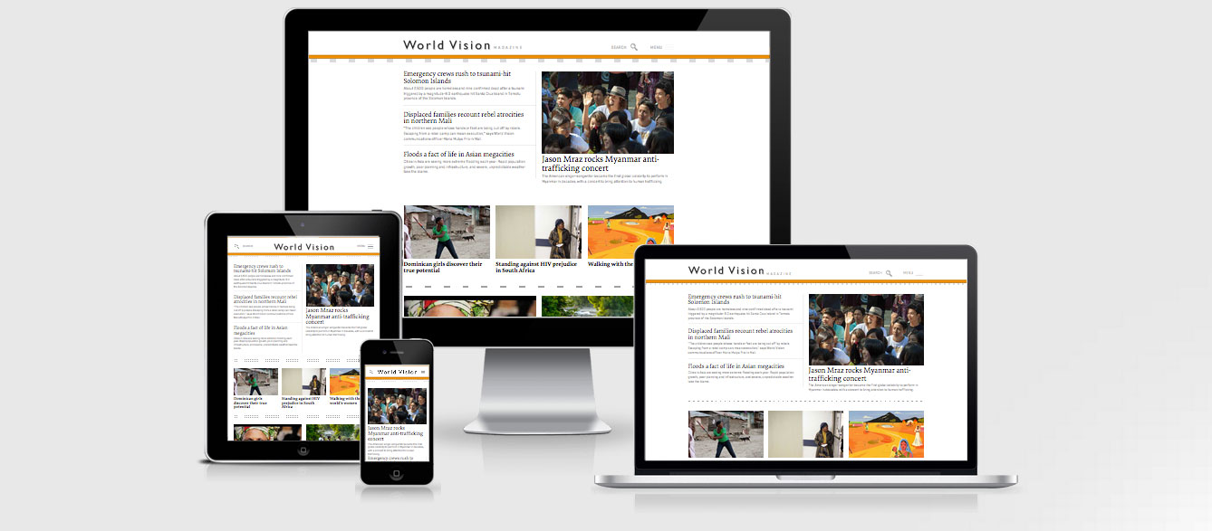
The Magazine of World Vision is built on Drupal and is a super clean looking responsive design (reminds me a bit of the Boston Globe).
There are a few areas they could look at for improving performance including concatenating their 4 CSS files, 2 JS files in the header and looking to work in a responsive image feature so that the mobile users are not downloading the full res images.
There are a few pages that have some great parralex journeys, see the Walking Worlds Women screen shot in the pictures. These are great on the larger screens but is too much information to contain on the smaller screen. They have used if(windowWidth > 980 && $menu.hasClass('stacked')) to stack the screen flow vertically when the viewport is less than 980px. This is also done for pullquotes at 800px and a hover class is removed on the search at 740px as it becomes a link to the search page instead.
It is interesting that they have maintained the three line menu icon for the entire website experience including click to open on the largest desktop viewports.
The strangest thing is the lack of plugins for the site, although not a bad thing, they don’t have the HTMl5 shim, modernizr or anything that would provide responsive capabilities to older browsers (like response.js).
The Magazine of World Vision Technical Details
Site Meta Tag
<meta name="viewport" content="width = device-width, initial-scale = 1.0, minimum-scale=1.0" />Media Queries
@media only screen and (max-width:1060px) {}

@media only screen and (max-width:980px) {}

@media only screen and (max-width:940px) {}

@media only screen and (max-width:800px) {}

@media only screen and (max-width:740px) {}

@media only screen and (max-width:600px) {}

@media only screen and (max-width:480px) {}

@media only screen and (max-width:400px) {}

@media only screen and (max-width:320px) {}
 A notebook you'll actually carry every day.