Pellican Books
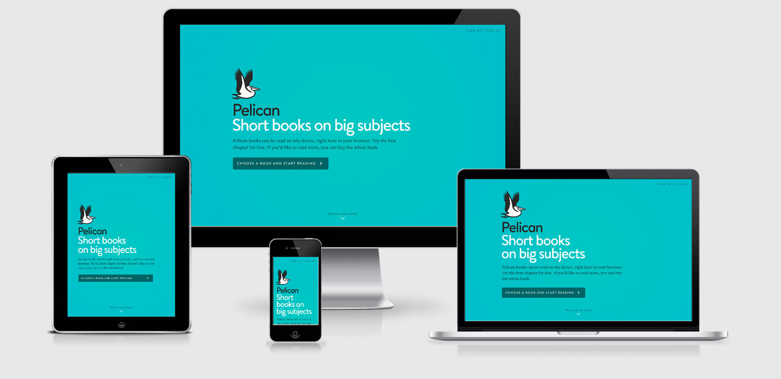
Use SVG for the pelican logo so that it will scale and look sharp on any screen.
They use http://underscorejs.org/ but they are very good an ensure that it’s all included just before the </body> tag. There’s a lot going on with their javascript but when disabled the site is still quite interactive and usable, however I couldn’t manage to sign in with JS disabled.
The have decided to set the maximum zoom to 1 and disable the user scaling option in the meta viewport tag, both which are accessibility issues (although I can not say whether they took those into consideration and decided the site is best off without the ability to zoom).
The use of media queries is great in this site. The site mostly focuses upon 4 major breakpoints but there is a tonne of other media queries for slight touches and a great use of height base media queries too. Uncompressed/un-minified the CSS is a staggering 54,514 lines.
Pellican Books Technical Details
Site Meta Tag
<meta name="viewport" content="width=device-width, initial-scale=1.0, maximum-scale=1.0, user-scalable=0">Media Queries
@media only screen and (max-width: 719px){ }

@media only screen and (max-width: 519px){}

@media only screen and (min-width: 960px){ }

@media only screen and (min-width: 1240px){}

@media only screen and (max-width: 359px){}

@media large{ }

@media only screen and (min-width: 1560px){ }

@media only screen and (min-width: 1240px) and (max-width: 1400px){ }
@media all and (max-height: 175px){ }

@media all and (max-width: 175px){}

@media all and (min-width: 550px){ }

@media all and (min-height: 1100px){ }

@media only screen and (min-width: 720px){ }
 A notebook you'll actually carry every day.