NASA
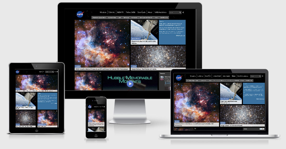
I love space, and therefore I love NASA, so I was very excited when NASA announced the launch of their new responsive website. For a very long time I’ve been looking at the NASA website with a heavy heart knowing that the could be doing so much more with the amazing content they’ve got, and now they are.
There are a few things that let this site down though. First of all it’s built in Drupal which isn’t actually a problem, however the front end is rendered through Ember and is just a blank black page when JS fails to fire. There are also several JS console errors which is dangerous when you’re relying on JS to render the site.
They use Bootstrap Framework for the responsive layout but it also seems as though they’ve spent a lot of time adding in little tweak points to make sure the site is just perfect across all viewports.
Another surprising element that is included is jReject.js which recommends users upgrade their browsers… not something I’d expect from NASA and I can’t decide if it’s bad or not.
NASA Technical Details
Site Meta Tag
<meta name="viewport" content="width=device-width, initial-scale=1.0, user-scalable=no" />Media Queries
@media (min-width:768px){ }
@media (min-width:992px){ }
@media (min-width:1200px){ }
@media (max-width:767px){ }
@media (max-width:1020px){ }
@media (max-width:430px){}
@media (min-width:1021px){}
@media (max-width:1121px){}
@media all and (-ms-high-contrast:none),(-ms-high-contrast:active){}
@media (min-width:1020px){}
@media (min-width:501px){}
@media all and (max-width:500px){}
@media all and (max-width:1050px){}
@media all and (max-width:600px){}
@media (max-width:400px){}
@media (max-width:700px){}
@media (max-width:757px){}
@media (min-width:350px){}
@media (min-width:510px){}
@media (min-width:350px){}
@media (min-width:1366px){}
@media (max-width:893px) and (min-width:768px){ }
@media (max-width:1200px) and (min-width:894px){ }
@media screen and (min-color-index:0) and (-webkit-min-device-pixel-ratio:0){@media{.player{display:block;top:calc((100% - 520px)/2);position:absolute}}}
 A notebook you'll actually carry every day.