Photoshop Etiquette
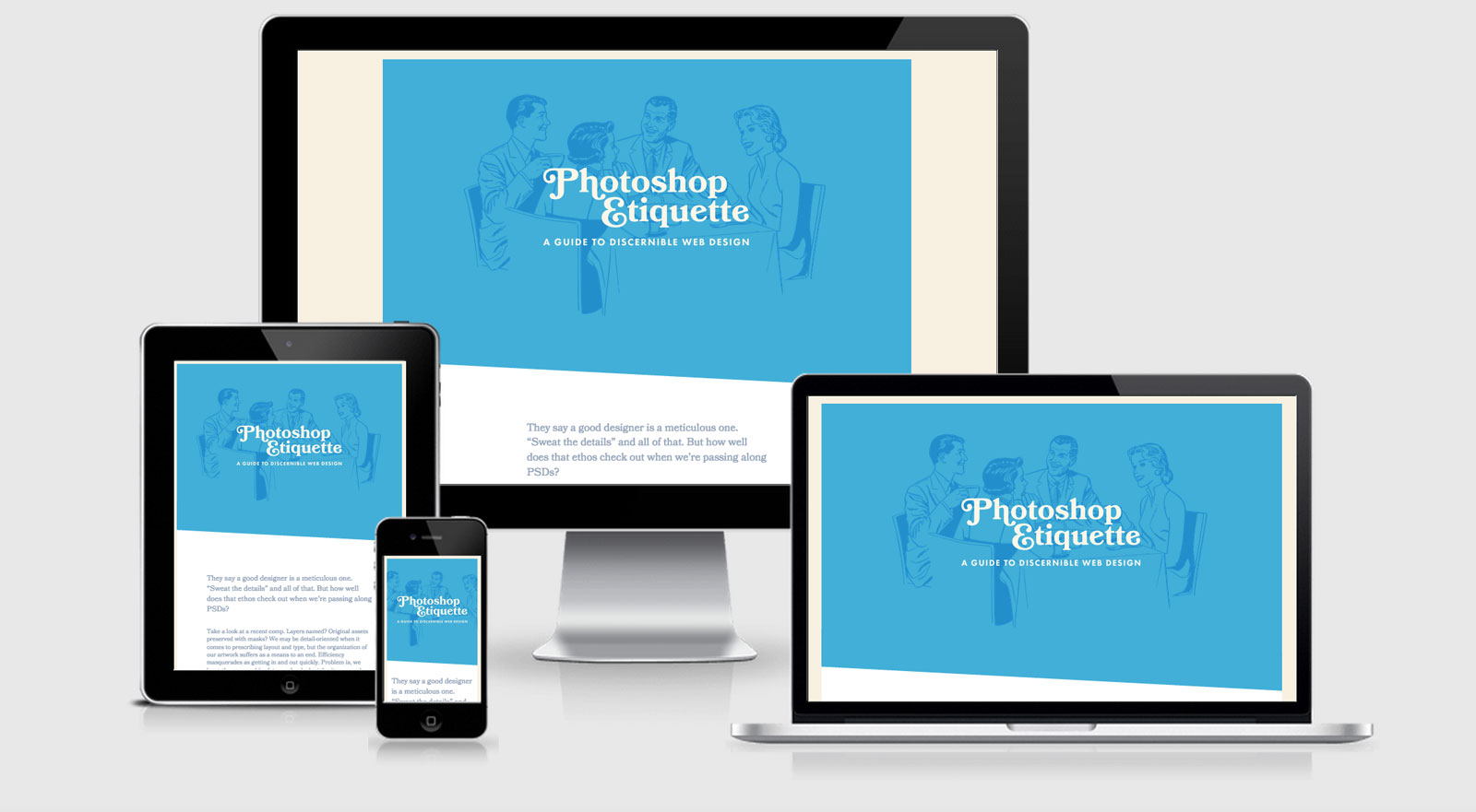
For a website that is entirely dedicated to Photoshop Etiquette I’m happy to say that it both looks beautiful and is built very well also. They team use Foundation as the base framework however it you wouldn’t be able to tell from the look of it.
From a cross device point of view the website is amazing with a lot of detail on performance. Even though the site is build upon wordress they have managed to avoid and tonne of http requests keeping it to only a single header and footer JS request.
The site doesn’t implement Critical CSS which would go to improve the first render time, however they’re hitting a little over 1s at the moment and it has only just launched so there’s improvements to come.
Both Flex Slider and Backstretch are being used, although they could almost drop backstretch in favour of going with a straight CSS solution (although I haven’t been able to find where it’s being used just yet).
Photoshop Etiquette Technical Details
Site Meta Tag
<meta name="viewport" content="width=device-width,initial-scale=1.0" />Media Queries
@media only screen and (min-width: 768px) { }

@media screen and (max-width: 860px) { }

@media only screen and (min-width: 60em) { }

@media only screen and (min-width: 46.875em) { }

@media only screen and (min-width: 31.25em) { }

@media only screen and (max-width: 60em) and (max-height: 50em) { }

@media only screen and (min-width: 25em) { }

@media only screen and (min-width: 40.625em) { }

@media only screen and (min-width: 60em) and (min-width: 31.25em) { }

@media only screen and (min-width: 60em) and (min-width: 40.625em) { }

@media only screen and (min-width: 46.875em) and (min-width: 31.25em) { }

@media only screen and (min-width: 78.125em) { }
 A notebook you'll actually carry every day.