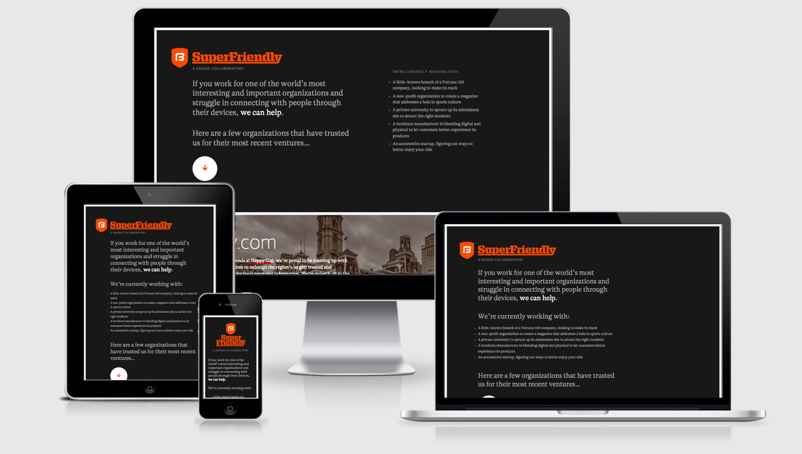
SuperFriendly

Dan employs Critical CSS for his site, however unlike some of my previous recommendations he is loading in the @import font-face rules. For me that is causing a HTTP request which is exactly what we’re trying to avoid by using the Critical CSS method. I’ve asked him to clarify this because I’m assuming he knows much better than myself (turns out it’s a work in progress with more updates to come… although with a single page website there’s not much point to a critical approach when it could all be inlined).
AS you would expect the SuperFriendly logo is done in SVG, but Dan takes it a special step further by including some media queries inside the SVG so that the words and the logo wrap vertically on small screen sizes. Very clever Dan, very clever.
The project is designed to attract new clients, but equally the site gives you plenty of reasons to not get in touch if you fall outside their working methods… better to know early.
There’s a bit ol’ chuck of Javascript at the bottom of the page, but it’s only a one page site so there’s no point in loading it in through a http request (which is probably also why the CSS is in the head, and not actually a Critical CSS move). The JS also has the Google Analytics and uses FontFace Observer to avoid the delay in displaying content while the fonts download.
SuperFriendly Technical Details
Site Meta Tag
<meta name="viewport" content="width=device-width, initial-scale=1" />Media Queries
@media screen and (min-width: 728px) { }

@media screen and (min-width: 1357px) { }

@media screen and (min-width: 1024px) { }
 A notebook you'll actually carry every day.


