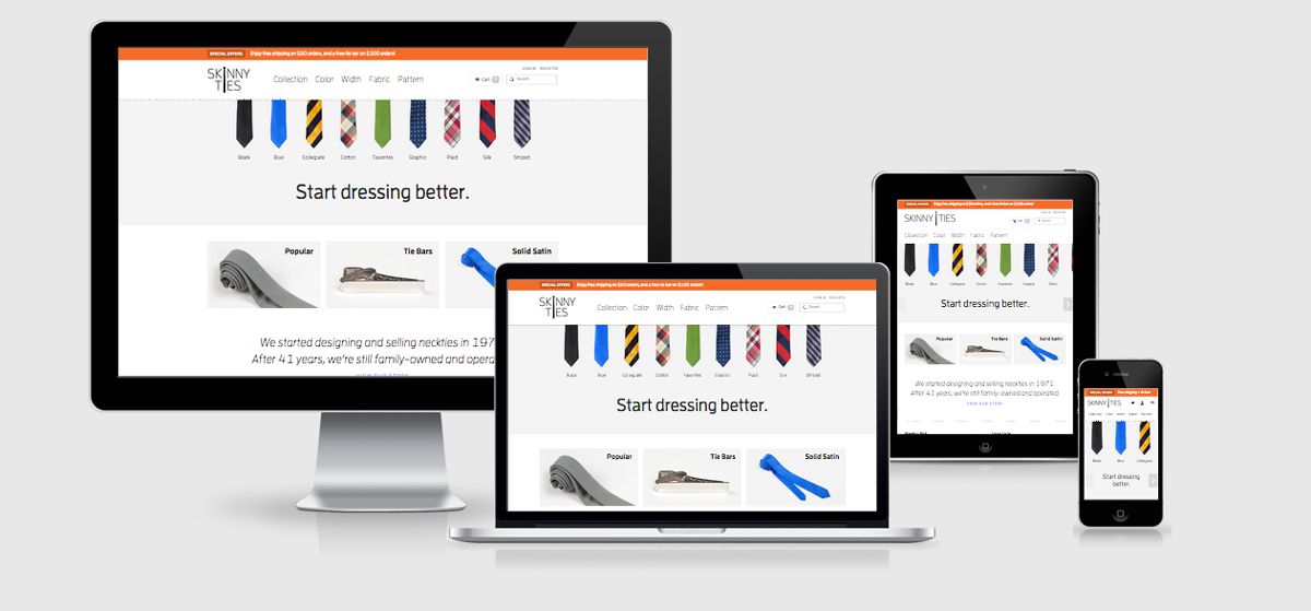
Skinny Ties

Skinny ties is a responsive ecommerce site built upon Magento CMS.
Who said responsive design costs you more money. With the redesign of Skinny Ties they have seen a massive increase in sales. But what did it cost them? Well they haven’t commented on the price but have hinted that between $30k – $75k for a Magento based RWD site is about normal.
Following on from the impressive increase in mobile conversions from O’Neills site, Skinny Ties are boasting a 211% increase in mobile sales after their redesign.
Moving to a responsive site meant reconsidering content, features and functions so the site would look and work better on tablets and smartphones, Skinny Ties says.
Skinny Ties Technical Details
Site Meta Tag
<meta name="viewport" content="initial-scale=1.0, width=device-width" />Media Queries
@media screen and (min-width: 371px) {}

@media screen and (min-width: 400px) {}

@media screen and (min-width: 480px) {}

@media screen and (min-width: 481px) {}

@media screen and (min-width: 600px) {}

@media screen and (min-width: 690px) {}

@media screen and (min-width: 768px) {}

@media screen and (min-width: 915px) {}

@media screen and (min-width: 1024px) {}

@media screen and (min-width: 1100px) {}

@media screen and (min-width: 1120px) {}

@media screen and (min-width: 767px) {}

@media screen and (min-width: 479px) {}

@media only screen and (-webkit-min-device-pixel-ratio: 1.5), only screen and (min--moz-device-pixel-ratio: 1.5), only screen and (min-resolution: 1.5dppx) {}

@media only screen and (max-width: 914px) and (-webkit-min-device-pixel-ratio: 1.5), only screen and (max-width: 914px) and (min--moz-device-pixel-ratio: 1.5), only screen and (max-width: 914px) and (min-resolution: 1.5dppx) {}

@media only screen and (max-width: 600px) and (-webkit-min-device-pixel-ratio: 1.5), only screen and (max-width: 600px) and (min--moz-device-pixel-ratio: 1.5), only screen and (max-width: 600px) and (min-resolution: 1.5dppx) {}
 A notebook you'll actually carry every day.


