Cotton Bureau
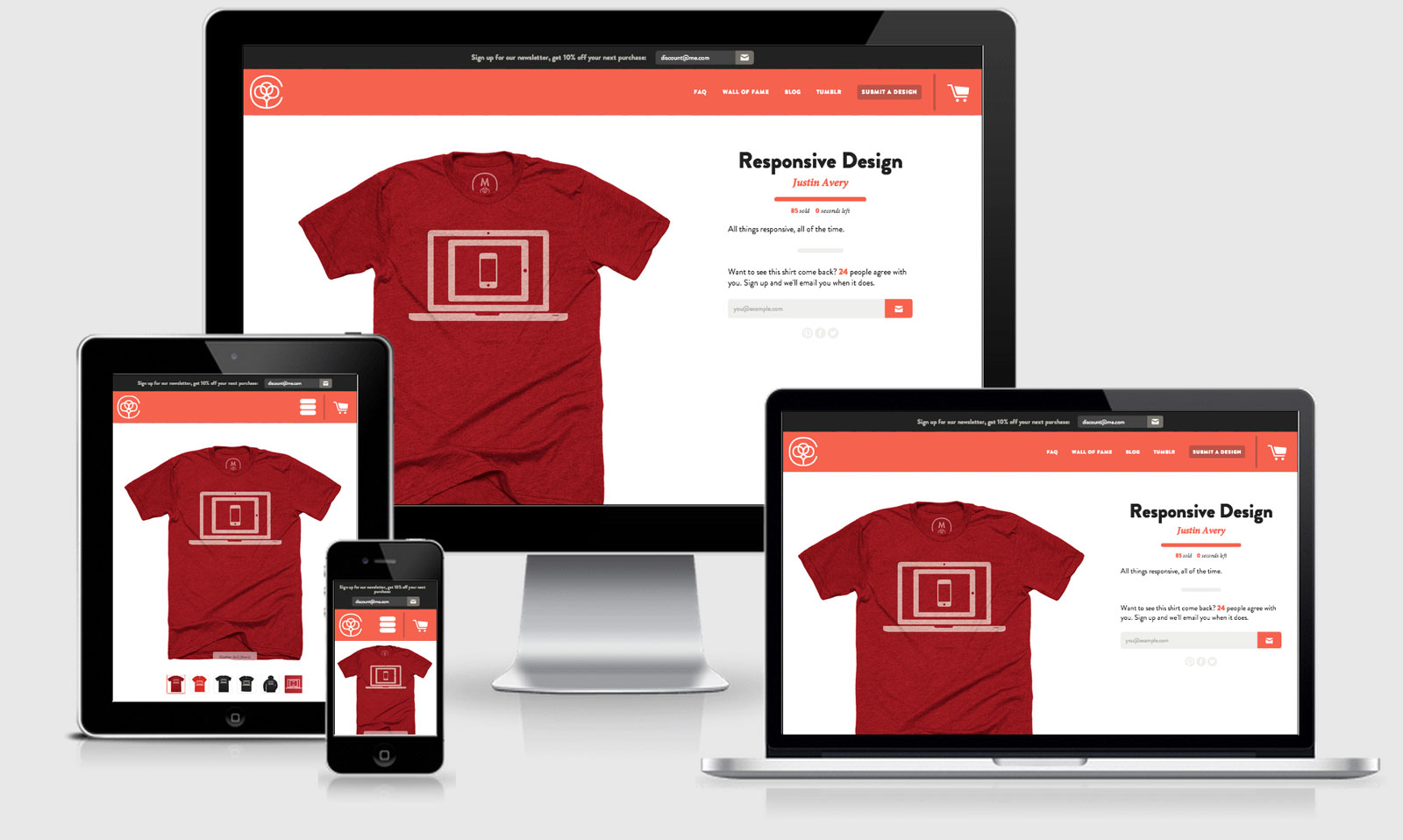
Cotton Bureau is a great responsive e-commerce site.
One of my favourite things about the site is the new and interesting way they’ve approached the checkout process. Once you choose your shirt the basket slides in from the right and you continue through the process horizontally… very cool.
For their business it’s all about the quality of the shirt and they have been able to show that off with range of different sized images pulled through depending on the DPI capabilities of the device.
They also lazy load in all of the images with <noscript> fall back to a standard image when JS doesn’t kick in.
There’s a few RWD things running on the page that I haven’t covered yet: TinyNav.js and CSS Wizardry Grids to be exact.
Cotton Bureau Technical Details
Site Meta Tag
<meta name="viewport" content="width=device-width, initial-scale=1, maximum-scale=1, user-scalable=no" />Media Queries
@media only screen and (min-width: 600px) { }

@media only screen and (min-width: 900px) { }

@media only screen and (min-width: 1900px) { }

@media (min-width: 640px) and (max-width: 960px) { }

@media (min-width: 1600px) { }

  @media only screen and (-webkit-min-device-pixel-ratio: 1.3), only screen and (min--moz-device-pixel-ratio: 1.3), only screen and (-o-min-device-pixel-ratio: 1.3 / 1), only screen and (min-resolution: 125dpi), only screen and (min-resolution: 1.3dppx) { }

@media screen and (min-width: 480px) { }

@media screen and (min-width: 720px) { }

@media screen and (min-width: 1024px) { }

@media screen and (min-width: 1280px) { }

@media screen and (min-width: 576px) { }

@media screen and (min-width: 1920px) { }

@media screen and (min-width: 2240px) { }

@media screen and (min-width: 2560px) { }

@media screen and (min-width: 2880px) { }

@media screen and (min-width: 3200px) { }

@media screen and (min-width: 3520px) { }

@media screen and (min-width: 3840px) { }
 A notebook you'll actually carry every day.