Rue21
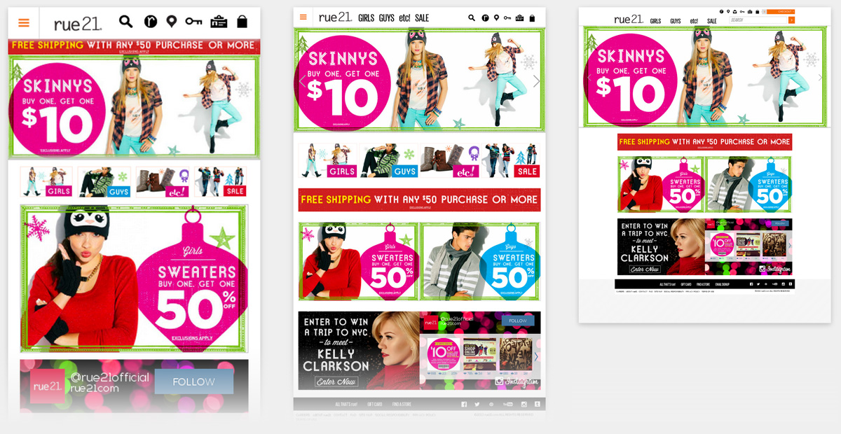
This is a great site with plenty and plenty of media queries to make every stage of the stretch just perfect.
<li>
    					<a data-reveal-id="static-modal" data-reveal-ajax="true" href="/store/jump/static/13600005">
	<img src="/store/resources/images/bg/clear-234x136.gif" alt="" data-interchange="[/content/Homepage_HomeCarouselTC4_GuysSkinnysBogo10_Mobile_768x321_V2.jpg, (small)],[/content/Homepage_HomeCarouselTC4_GuysSkinnysBogo10_Tablet_1028x430.jpg, (medium)],[/content/Homepage_HomeCarouselTC4_GuysSkinnysBogo10_DesktopTablet_1400x586.jpg, (large)]" height="586" width="1400" usemap="#imageMapholidayguysskinnys1384092256331" />
	</a><map name="imageMapholidayguysskinnys1384092256331" id="imageMapholidayguysskinnys1384092256331">
			  <area shape="rect" coords="4,2,525,589" href="/store/jump/category/Skinny/cat1120008">
  <area shape="rect" coords="523,3,1410,526" href="/store/jump/category/Skinny/cat1120008">
  <area shape="rect" coords="634,514,1394,584" href="/store/jump/category/Skinny/cat1120008">
  <area shape="rect" coords="522,550,637,587" href="/store/jump/category/Skinny/cat1120008"></map>
	</li>
They are using Foundation 4 as the primary but have also included a javacript plugin called collapse.js which is based on bootstrap-transition.js.
A great comment in the JS included /* jeff is breaking stuff...way to go jeff. commenting out for now *//*
Rue21 Technical Details
Site Meta Tag
<meta id="viewport" name="viewport" content="width=device-width" />Media Queries
/* Small Displays: 0 - 767px, larger screens inherit unless they override these styles */

@media only screen {...}
/* Medium Displays: 768px - 1279px, larger screens inherit unless they override these styles */
@media only screen and (min-width: 48em) {...}
/* Styles for screens that are atleast 1200px; */

@media only screen and (min-width: 75em) {}
/* Large Displays: 1200px - 1440px */

@media only screen and (min-width: 75em) {}
/* X-Large Displays: 1400px and up */

@media only screen and (min-width: 90em) {}
/* Foundation Block Grids for above small breakpoint */

@media only screen and (min-width: 48em) {}
/* Foundation Block Grids for above medium breakpoint */

@media only screen and (min-width: 75em) {

  /* Remove medium grid clearing */}
@media only screen and (min-width: 48em) {...}
@media only screen and (min-width: 58.75em) {...}
@media only screen and (min-width: 768px) {...}
@media only screen and (max-width: 768px) {...}
/* Small Displays: 0 - 767px, larger screens inherit unless they override these styles */

@media only screen {

	/* ADD STYLES HERE FOR ALL SCREENS */}
/* Medium Displays: 768px - 1279px, larger screens inherit unless they override these styles */

@media only screen and (min-width: 48em) {

	/* ADD STYLES HERE FOR MEDIUM SCREENS */}
 A notebook you'll actually carry every day.