The Great Discontent
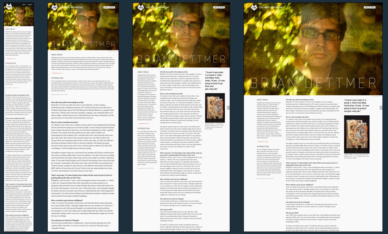
The Great Discontent (TGD) is a beautiful online journal of some of the best designers around. Always an inspiring read and perfectly laid out across multiple devices.
Along with the resources you can see below TGD has also added a few tweaks to make the reading experience all that much more enjoyable.
These include,
- Skipping the iphone URL bar (remysharp.com)
- Fix for the iphone viewport scale bug (highub.com)
- Below Fold
The Great Discontent Technical Details
Site Meta Tag
<meta name="viewport" content="width=device-width; initial-scale=1.0">Media Queries
/* Main Styles */

@media only screen and (min-width: 1024px) and (max-width: 1140px)
@media only screen and (max-width: 767px)
@media only screen and (max-width: 1023px)
@media only screen and (min-width: 768px) and (max-width: 1024px)
@media only screen and (min-width: 768px) and (max-width: 1023px)
@media only screen and (min-width: 480px) and (max-width: 1023px)
@media only screen and (min-width: 480px) and (max-width: 767px)
@media only screen and (-webkit-min-device-pixel-ratio: 2), only screen and (min-device-pixel-ratio: 2)

/* Yaron Schoen Specific */
@media only screen and (max-width: 1024px)
@media only screen and (min-width: 600px) and (max-width: 1023px)
@media only screen and (max-width: 767px)
@media only screen and (min-width: 768px) and (max-width: 1023px)
@media only screen and (min-width: 768px)
@media only screen and (max-width: 767px)
 A notebook you'll actually carry every day.