Microsoft
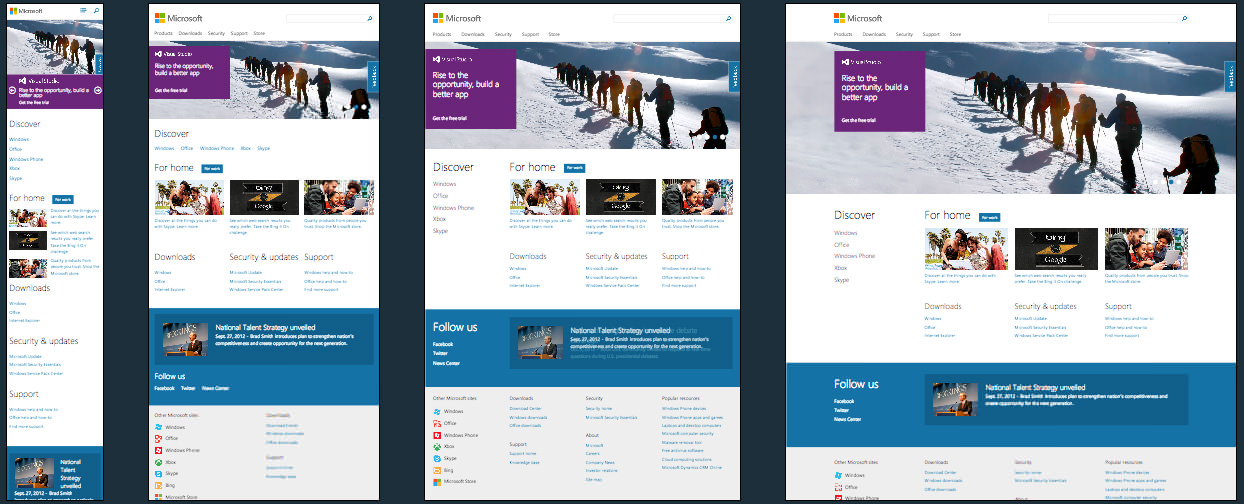
This is a wonderful site brought to us by the guys at Paravel. Microsoft kicked off their responsive movement with the the Build website and have done a wonderful job on this site.
I noticed that the breakpoints seem to have been added on an adhoc basis in the CSS. I imagine this was due to several CSS files being worked on in development and finally concatenated into a single css file for the site.
Another strange thing found with the CSS was with the media queries and how they change between min/max pixel widths and go to min-widths with ems for the hero slider. They even take care and include a pixel based height for one of the slider media queries.
To serve up the responsive images they seem to have gone with
Scott Jehls Picturefill judging by the following code…
<div data-picture data-alt="Microsoft" class="mscom-logo"><div data-src="http://i.s-microsoft.com/global/ImageStore/PublishingImages/logos/hp/logo-lg-1x.png"></div><div data-src="http://i.s-microsoft.com/global/ImageStore/PublishingImages/logos/hp/logo-lg-2x.png" data-media="(min-device-pixel-ratio: 2.0)"></div><div data-src="http://i.s-microsoft.com/global/ImageStore/PublishingImages/logos/hp/logo-sm-1x.png" data-media="(max-width: 539px)"></div><div data-src="http://i.s-microsoft.com/global/ImageStore/PublishingImages/logos/hp/logo-sm-2x.png" data-media="(max-width: 539px) and (min-device-pixel-ratio: 2.0)"></div><noscript><img src="http://i.s-microsoft.com/global/ImageStore/PublishingImages/logos/hp/logo-lg-1x.png" alt="Microsoft" /></noscript></div><script type="text/javascript">window.picturePolyfill.resolveFirst();</script>
Scott has provided so many awesome tools for responsive design it’s great to see his hard work on show on something this big.
The slide show that is used doesn’t appear to be anything that I’ve seen before, but it’s probably based on something we’ve see before.
If you know some other details that have gone into the build please let us know so that we can update this description and provide some tips and direction for web developers everywhere.
Microsoft Technical Details
Site Meta Tag
<meta name="viewport" content="width=device-width, initial-scale=1.0" />Media Queries
@media screen and (min-width:540px)
@media screen and (min-width:680px)
@media screen and (min-width:900px)
@media screen and (max-width:539px)
@media screen and (max-width:540px)
@media screen and (min-width:33.75em)
@media screen and (min-width:42.5em)
@media screen and (min-width:64.0625em)
@media screen and (min-width:64.0625em)and (min-height:768px)
@media screen and (min-width:560px)
@media screen and (min-height:640px)
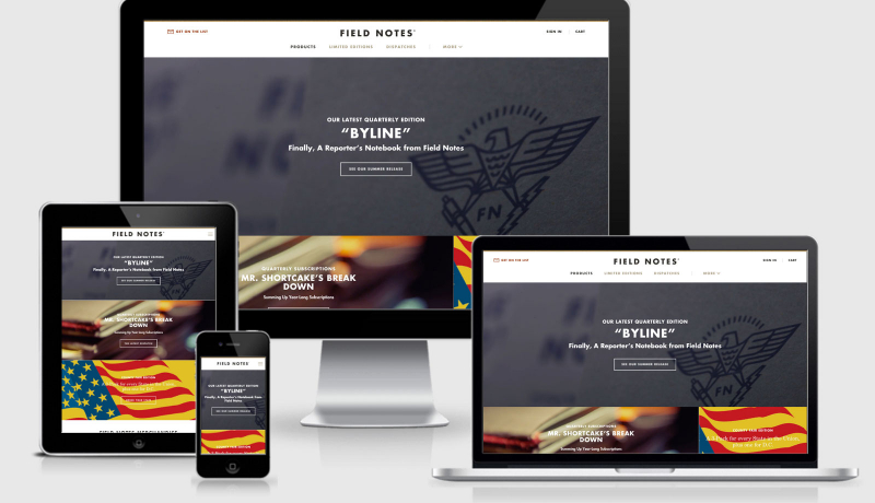
 A notebook you'll actually carry every day.