responsive table patterns
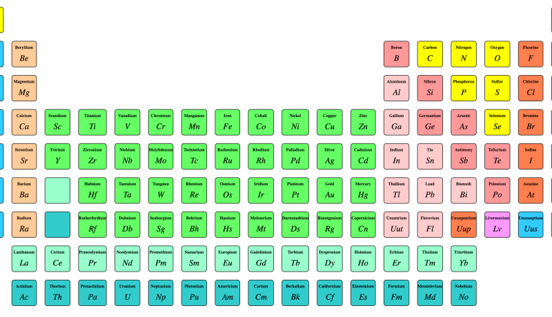
The number of columns displayed in the table below depends on the available screen space, by default; a smartphone will display 2 columns.
This is accomplished by assigning semantic classes to the column headings that indicate which data values take precedence (essential vs optional), in combination with media queries to display them at different screen widths (a.k.a., responsive design).
An excerpt from responsive table patterns
 A notebook you'll actually carry every day.

