CSS3 Media Queries
 A notebook you'll actually carry every day.
I’m surprised this hasn’t been featured before. A site that shows which media queries are fired when you visit the home page, plus an overview of media queries and a real time testing page. They also provide a series of target devices, snippets and instructions on Responsive Adsense.
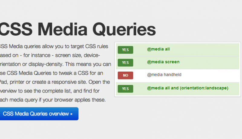
CSS Media queries allow you to target CSS rules based on – for instance – screen size, device-orientation or display-density. This means you can use CSS Media Queries to tweak a CSS for an iPad, printer or create a responsive site. Open the overview to see the complete list, and find for each media query if your browser applies these.
An excerpt from CSS3 Media Queries