CSS Media Queries

CSS Media Queries

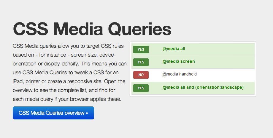
We all know that Media Queries are one of the three key ingredients for a responsive design, but not everyone understands that media queries go beyond min/max-width, orientation and pixel density.

This website allows you to test the devices you are using as well as build up media queries for use on your own site.

  • Resource Name

    CSS Media Queries

  • Resource Creator

    Niels van Hove

Description

CSS Media queries allow you to target CSS rules based on - for instance - screen size, device-orientation or display-density. This means you can use CSS Media Queries to tweak a CSS for an iPad, printer or create a responsive site. Open the overview to see the complete list, and find for each media query if your browser applies these.

View on Github Download Resource

Subscribe to our Newsletter

Add your email address and receive an email every Friday covering off everything worth knowing about building your websites responsively.