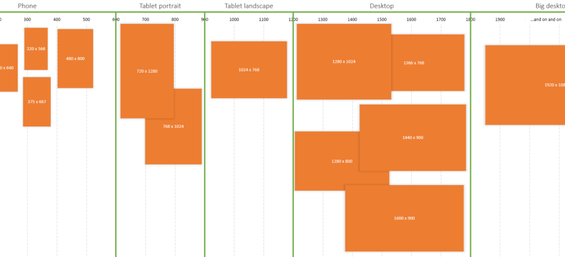
Breakpoints And The Future Of Websites
In the spirit of sharing interesting approaches to responsive design this article is worth a read. The author suggests loading location, orientation, bandwidth, device group, device class and others as css classes on the HTML element (similar to how Modernizr works with feature detection). This is going back performing device detection to cater for specific cases across an ever growing number on devices when instead we should be building from the content out and adding breakpoints as the content dictates.
In web design today, the thresholds we fixate on the most relate almost exclusively to screen size. The major challenge over the last few years has been designing for mobile devices, and, with screen size being the obvious focal point, our primary intent has been to adapt the layout of our web pages to tally with the specific display characteristics of the target environment.
An excerpt from Breakpoints And The Future Of Websites
 A notebook you'll actually carry every day.

