Breakpoints And The Future Of Websites
 A notebook you'll actually carry every day.
In the spirit of sharing interesting approaches to responsive design this article is worth a read. The author suggests loading location, orientation, bandwidth, device group, device class and others as css classes on the HTML element (similar to how Modernizr works with feature detection). This is going back performing device detection to cater for specific cases across an ever growing number on devices when instead we should be building from the content out and adding breakpoints as the content dictates.
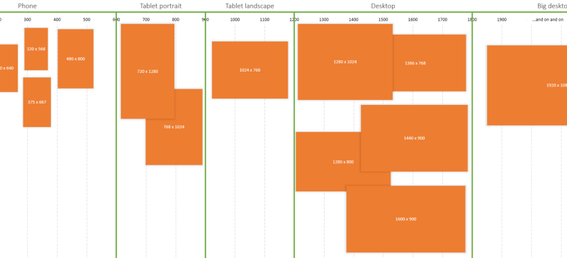
Media queries, it turns out, are extremely rigid. Usually, you are forced to employ breakpoints in ways that are not exactly intuitive nor inline with your core design aspiration. In other words, you have to fit your design aspiration to its capabilities. So, you may have a vibrant imagination about your own thresholds, but more than likely media queries won’t let you apply them the way you envisage.
An excerpt from Breakpoints And The Future Of Websites