Learning from Lego: A Step Forward in Modular Web Design
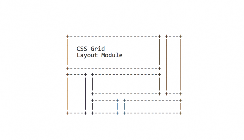
A few years back I did a talk that compared the CMS I worked with to a box of lego and played on the fact that if you could become a master builder you could create any web experience imaginable with the tools at your fingertips. This article, however, takes a look at the spacing between the dots on lego and their margins/borders. Samantha Zhang then uses the lego layout and applys it to a grid system in CSS. Very very cool.

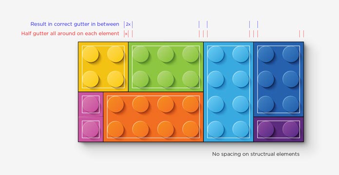
Take a look at the top of any individual Lego brick. If you see the space around the outside of the pegs as the padding of a web element, and everything inside the padding as the content, you will find that all Lego bricks have a consistent padding surrounding the content, which is exactly half of the gap between elements.
And when Lego bricks are placed together, all the elements will have the same gutter in between.
No other padding or margin needed; the gaps are naturally formed. All the elements—no matter how deeply they are nested—appear to be on the same level and need no CSS override or adjustment, not even the
first-andlast-childreset.Putting it in code, we can make a class that adds the half-gutter spacing, and apply it to all the lowest-level web elements on the page. Then we can remove all the spacing on structural
An excerpt from Learning from Lego: A Step Forward in Modular Web Designdivslike.rowand.col.
 A notebook you'll actually carry every day.


