Breaking Down a CSS Grid Layout
 A notebook you'll actually carry every day.
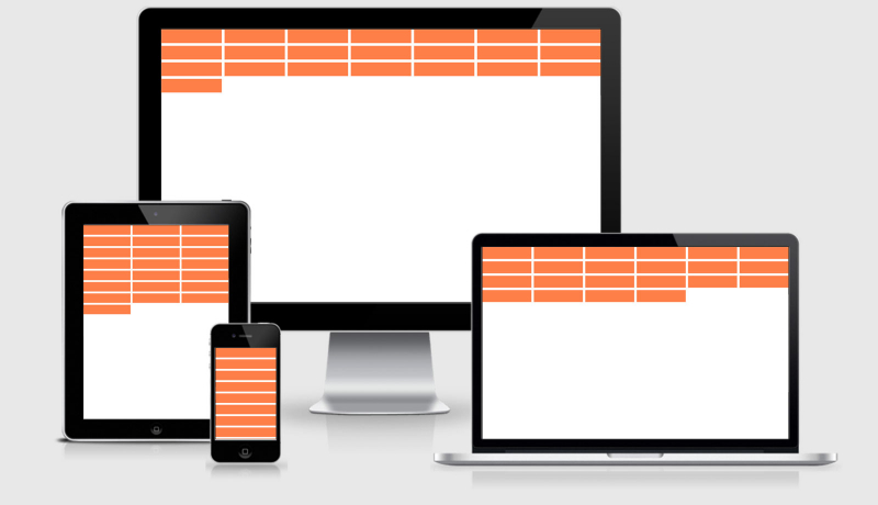
A really specific review of the repeat(auto-fit, 200px) for grid-template-columns that allows you to build responsive flexible grid columns without having to worry about declaring any media queries

There are already a lot of great articles out there explaining in depth what you can do with Grid Layout (I linked to some of them at the bottom of this post), so I’m not here writing an “Intro to CSS Grid Layout,” kind of thing — you can get that by Googling around a bit. I’m going to focus on a few specific things and one grid declaration I came across recently:
An excerpt from Breaking Down a CSS Grid Layout