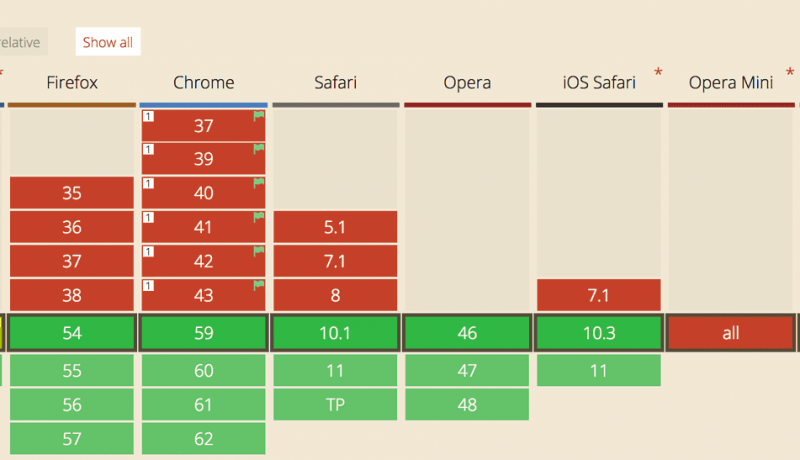
CSS Grid Responsive Layout
 A notebook you'll actually carry every day.
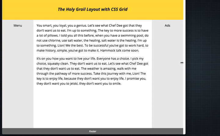
A three line approach to creating a responsive grid system.
.container {
  display: grid;
  /* Display as a Grid */
  grid-template-columns: repeat(auto-fit, minmax(200px, 1fr));
  /* repeat = as many times as you can fit */
  /* auto-fit = fit as many items on the line as possible, go bigger if you need to */
  /*minmax = (min size, max size) = the minimum size the column should be is 200px, but if there's space then give them all 1fr of that width. */
  grid-gap: 10px;
}

See the Pen CSS Grid Responsive Framework by Justin Avery (@justincavery) on CodePen.