Solving a Tricky Layout Problem with CSS Grid
 A notebook you'll actually carry every day.
Michelle takes us through a layout she was trying to achieve and the different approaches used to reach the right outcome. I love real life ‘how I approached a problem’ articles.
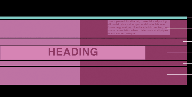
So far so good. It looks like we’ve got this layout nailed. There’s just one problem: When the text block is longer than the space between the heading and the top of the image the component expands to accommodate it, pushing the image and heading downwards (which is what we want) – but unfortunately the bottom of the grid also expands, giving us extra space below the image:
If we have several components stacked on top of each other then the vertical space between them will be uneven. This isn’t ideal. What we want is for the component to grow vertically at the top (the side of our text block) but not the bottom.
To fix this I had to think creatively! Let’s walk through the solution step-by-step.
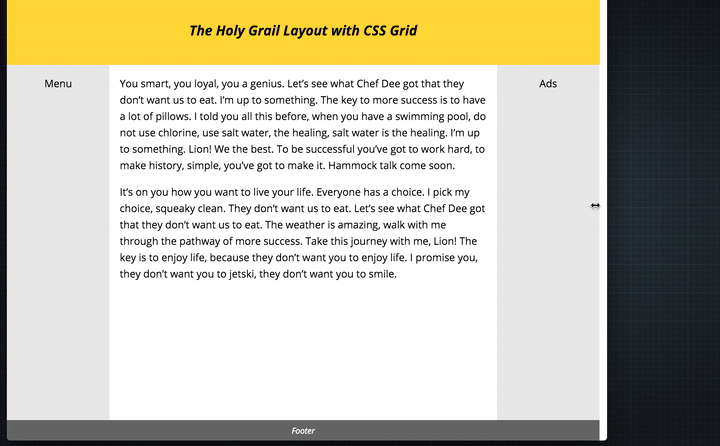
An excerpt from Solving a Tricky Layout Problem with CSS Grid