Multi-column manipulation
Another post from the very clever Heydon Pickering on the Every Layout site, this time all about adding multi-columns to your layout. I’ve looked at multicolumn in the past, specifically around constraining the height of the item to 100vh and letting the number of columns span off on the horizontal. I used it as an experiment for displaying websites for languages with different flows (Chinese for example).

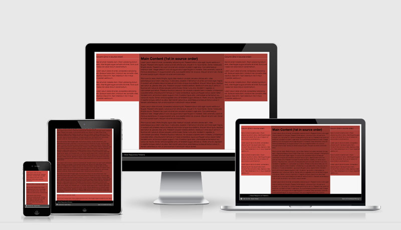
Despite predating both Grid and Flexbox, Multi-column Layout represents—at least to me—an even more radical departure from the way we normally do and think about CSS layout. Dividing just one element into a multi-column representation of its contents feels weird, heretical even.
Setting a multi-column context means asking (flow) content to progress, by column, in a horizontal direction. This invokes one of two issues, depending on whether you set a height on the element.
With no set height, there’s no limit to the height of the columns. This will result in vertical overflow, and the necessity to scroll down and up the page to read each successive column. Many are likely to find this arduous.
An excerpt from Multi-column manipulation
 A notebook you'll actually carry every day.


