Dark mode with stack overflow
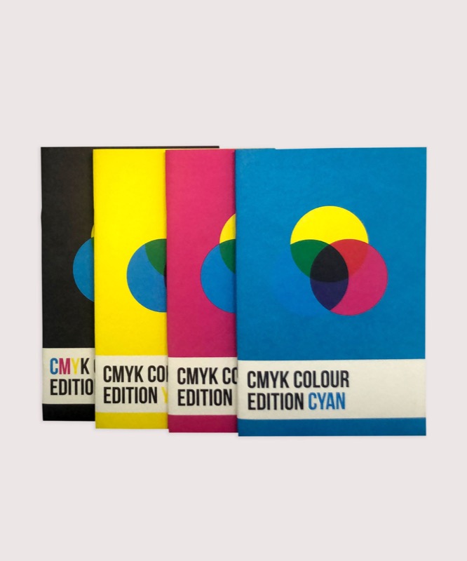 A notebook you'll actually carry every day.
StackOverflow now has a Dark Mode. This tutorial goes through the entire process from finding the right colours across their brand assets to how they implemented it through the CSS.
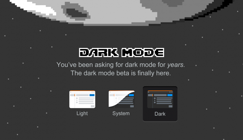
I often find the usable contrast to be way too low. It’s hard to use the full spectrum of colors to express your interface. It’s even harder to introduce depth with shadows and other visual cues. Light text on dark backgrounds is fatiguing to my eyes. Things that are hard to manage on light screens like simultaneous contrast is even harder to manage against dark backgrounds.
But here I am, the guy who finally shipped dark mode on Stack Overflow.
An excerpt from Dark mode with stack overflow