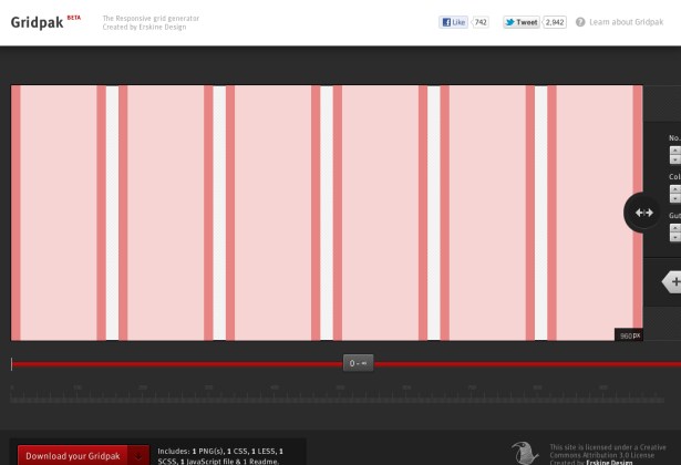
1140 Grid
1140px grid was one of the original grids developed as we were getting into the responsive way of thinking.
It still takes the desktop first approach and allows you to switch to smaller viewports as you work through.
The name seems to give away the mindset that many of us were in when RWD first began to edge into our workflow. We wanted to embrace this responsive way of working but we were still fixed upon a specific width.
This grid also requires the use of an .alpha and .omega class to denote first and last rows on your grid to remove the left and right padding respectively. These days grids are either using border-size: border-box; to eliminate the extra padding issues with grids, or alternatively you can use the much more supported CSS3 feature :nth-child where you can target the last element in your grid and remove the margin that way.
 A notebook you'll actually carry every day.


4 thoughts on “1140 Grid”