Viewport Resizer
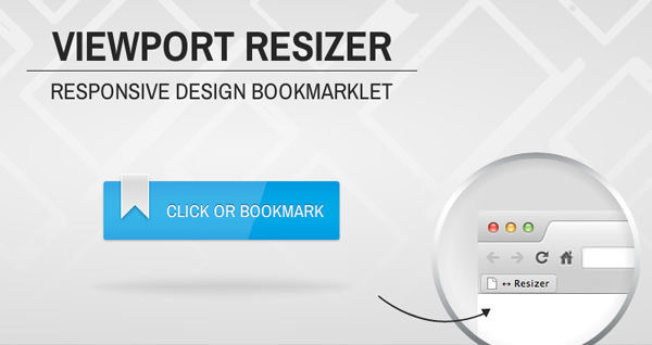
Viewport resizer is a browser-based tool to test any website’s responsiveness. Once you activate the bookmarklet you have a series of predefined device icons that appear along the top of the browser to just between viewports.
As they point out on the site this shouldn’t replace REAL device testing, but it’s a nice tool to use to check during build.
 A notebook you'll actually carry every day.

