Finesse with Flex
 A notebook you'll actually carry every day.
Flexbox allows you to make the most subtle of changes to your code that result in the perfect layout you desire, and often with only a line or two of CSS.
This site recently underwent a responsive redesign, but because it is a personal project of mine I decided to push the updated design live — warts and all.
The result is getting something out in the open with the content still accessible but with a few edge case tweaks that were needed from place to place.
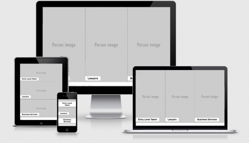
One of the areas that I noticed was a little off was the Examples section. One larger screens I think it looked good, but when viewed on mobile the example listing images were so small you couldn’t make them out, and the image came after the Title and “View now” button which I didn’t like.
Previously, without Flexbox, this would have been a bit of a pain in the arse to swap source order of the HTML, change the floating properties of each of the elements, maybe add some negative margin, relative/absolute positioning to get things working the way I wanted to.
The markup to start with was
<div class=”grid__row”>
<header class=”section__header”>
<h2 class=”section__title”><a href=”…”>Ethan Marcotte</a></h2>
<p class=”lead”>Ethan Marcotte RWD</p>
<a href=”…” class=”btn btn–alt-cta”>Read More</a>
</header>
<div class=”section__body”>
<img src=”…” />
</div>
</div>
With Flexbox it was as simple as adding
display:flex;
flex-direction:column-reverse;
display:flex ensured that the contents of the containers occupied all of the available space on the horizontal, and flex-direction:coloum-reverse swapped the display of the source order for me.
You can see the different screen shots below, or just head over to the responsive design examples to see for yourself.