Vertical -> Horizontal Feature Home Page Layout
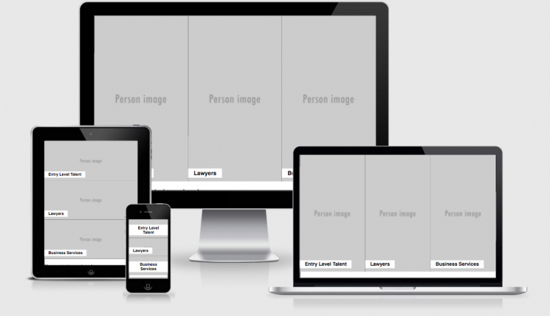
This week the snippet comes from a component/module that I had created in codepen to show a client what I was referring to when talking about the layout changing from vertical to horizontal when increasing the viewport. There are three key feature blocks that need to be shown “above the fold”, on small screens we want to stack them on top of each other and on larger viewports we want to sit them next to each other.
To a lot of clients I may as well have been saying “bling blang fling flong wobble dibble dobble”. By handing them a phone, a tablet and a laptop with the same codepen open they could then see exactly what I meant.
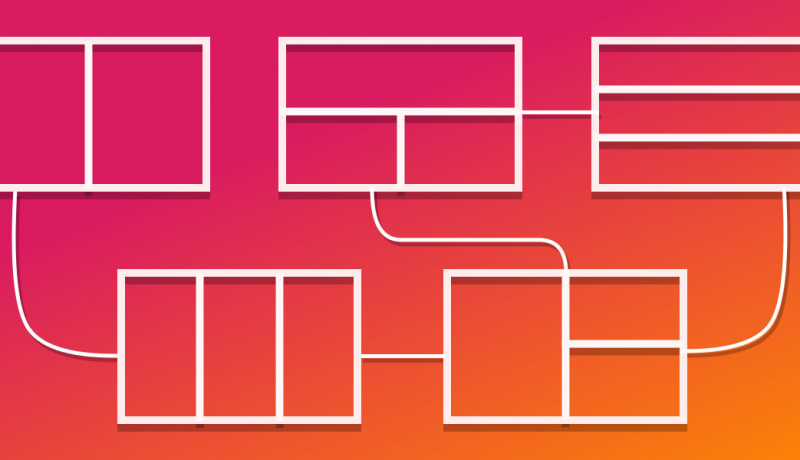
flex-direction is such a valuable tool, not just for realigning page elements like this but for juggling items that might need their visual order different to their source order.

.feature-modules {
  height: 95vh;// almost full viewport height
  display: flex;
  justify-content: space-around;
  flex-direction: column;// display vertically
  @media (min-width:800px) {// when more than 800px
    flex-direction: row;// display horizontally
  }
  section {
    display: flex;
    flex: 1 1 33%;// grow or shrink to fit all items
    border-bottom: 1px solid ;
    align-items: flex-end;
    @media (min-width: 800px) {
          border-right: 1px solid ;
    &:last-child{ border-right: none;}
      border-bottom: none;
    }
See the Pen Vertical -> Horizontal Feature Home Page Layout by Justin Avery (@justincavery) on CodePen.
 A notebook you'll actually carry every day.


