RWD Weekly #261
 A notebook you'll actually carry every day.
Welcome to RWD Weekly edition #261.
It wasn’t until I had sent the email last week that I realised that this time of year, aside from being the anniversary of the RWD article from Ethan, but it falls a few days before my own anniversary with my wife Laura. I mention this specifically because Laura deserves a massive digital round of applause for putting up with me not being available over the past 261 Thursday evenings.
It also reminded me that on the same day 12 months ago I was saying to Laura “Just 2 more minutes and then I’ll send this newsletter to the queue… then we can go to the hospital” which also happened to be about 3 hours before the birth of our daughter who turned 1 on Friday. Happy Birthday Gorgeous!
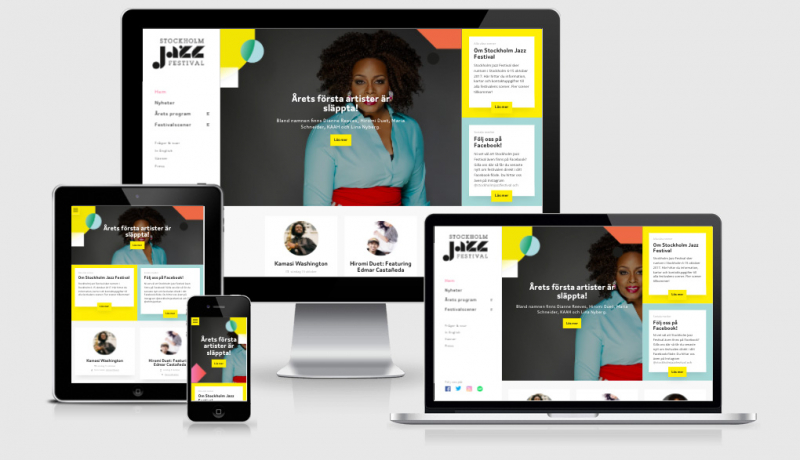
Enough of that though… our feature site this week is from Sara Soueidan who has done an awesome job on her personal site. I’m looking forward to doing a review of this site for our examples section.
Snippet Show
For a long time, I thought about being really specific about the CSS Grid and where things should go. This week I spent some time looking at its fluidity and responsiveness and came across a great article from Charlotte Jackson (see the first article in the tutorials). It was this that made me realise the power of the min/max and auto-fit and auto-fill options. Let’s take a look:
.container {
display: grid;
/* Display as a Grid */
grid-template-columns: repeat(auto-fit, minmax(200px, 1fr));
/* repeat = as many times as you can fit */
/* auto-fit = fit as many items on the line as possible, go bigger if you need to */
/*minmax = (min size, max size) = the minimum size the column should be is 200px, but if there's space then give them all 1fr of that width. */
grid-gap: 10px;
/* Leave a 10px gap between each grid row/column */
}
Viola, you have a responsive structure with no media queries fallback layout AND grid in one. Charlotte goes into more detail on how she arrived here, make sure you check out that article. I’ve dropped in a codepen of this on the patterns area of the site to help if you’re more of a hands on person.
Sponsor

CSS Dev Conf 2017 ⚜ New Orleans
From animation to webpack dragons, CSS Dev Conf is where to level up your front-end design and development! Join Mina Markham, Harry Roberts, Sarah Drasner, Chris Coyier, and many more in the French Quarter of New Orleans this October 9-11th. Use the code RWDWEEKLY to get $75 off any workshop. With Coyier, Wes Bos, Sarah Drasner+Val Head, and Micah giving workshops—it will be hard to pick which one to go to.
Register now for CSS Dev Conf 2017 New Orleans
Articles
The Mindfulness of a Manual Performance Audit
This is a pretty cool way to approach a performance review of your site without just using the reports provided by Web Page Test. Technically you actually _still_ need to use WPT to get the raw data but then it’s all yours from there. This is actually kinda timely for me as I’m looking back into using SiteSpeed.io for work hosting on a Docker Instance on Digital Ocean…. and speaking of that check out free SSL below…
Stop Paying for SSL Certificates
As I mentioned in the article above, I’m testing out some Digital Ocean servers again. During the setup I had a lovely message telling me that Let’s Encrypt was almost configured with a link to the instructions on how to finish the job. Kudos to you Digital Ocean! This article tells you how you can go about doing this yourself.
Designing More Efficient Forms: Structure, Inputs, Labels And Actions
Hey — remember that form you were going to build tomorrow? Well before you start please please please make sure you spend 10 minutes going through this article. Make sure you write stuff down too because I don’t want to see any more forms that don’t follow these pretty simple guidelines. Your users will thank you for it.
traintimes.org.uk performance notes
I love it when people take official websites and then make much faster and better versions of them — just like Matthew has done with traintimes.org.uk
Pinboard Acquires Delicious
Oh wow, I wasn’t sure if this was true or an April Fools. Pinboard is amazing by the way.. you can find every single article ever shared over there – I use it a lot!
HTTP/2 push is tougher than I thought
Jake digs deep into HTTP/2 push and looked at just how well supported it is at the moment. The underlying story here is that push might not be the golden child we were hoping for, and for different uses across different browsers, it has different capabilities.
On Conference Speaking
A terrific overview of the process you can go through to create a conference talk.
Upgrading Ele.me to Progressive Web App
An incredibly detailed article about moving over to a Progressive Web App from the front end engineer who did a lot of the work. This is a little different as well because it’s not a typical single page app, it’s a purposefully built multipage app. It’s pretty long but if you’re thinking about moving your companies mobile site across it goes through all the steps you should be expecting to follow
HTTPS on Stack Overflow: The End of a Long Road
Sometimes setting up HTTPS is as easy and putting Cloudflare in front of it and other times it’s way more complicated. Take a look at how Stack Overflow approached their migration.
Learn from customers faster with NomNom //Sponsor
Get all your customer feedback and user research in one place
Tutorials
An introduction to CSS Grid
I have to admit for a while I looked at the CSS Grid as something that would place things on a grid and have a fairly strict way of laying them out… not responsive you might say. This article from Charlotte shows how the use of auto-fill and auto-fit can be added to the grid-template-columns to provide flexible responsive grids.
11 things I learned reading the flexbox spec
This very nearly became the snippet show for the next 11 weeks because of how awesome this article is. If you’re using flexbox in your implementations then do yourself a favour and spend a few moments levelling up with this (very) entertaining and informative tutorial.
Developing A Chatbot Using Microsoft’s Bot Framework, LUIS And Node.js
If you’re looking to get started with Chat Bots then you should check out this first in a series of articles on Smashing Mag. The first part is getting your bot set up on the Microsoft framework and getting node running with some error checking and interface controls. The next part, I’m hoping next week, is all about using LUIS to perform natural language processing so your Bot will understand my Australianisms.
Full Page Background Video Styles
Chris covers off a nice tutorial on how to get a full page background video going across multiple viewports. Don’t forget to drop in some checks to see if someone has enabled prefers-reduced-motion and stop the video from playing automatically.
Getting free wifi
If you travel by planes, trains or automobiles; or if you’ve stayed in a crappy hotel then chances are you’ve been foiled by their ’30 minutes free wi-fi’. Well now you can update your MAC address with this handy tip and you’ll be surfing free net for as long as you like ( but sorry I can’t help you with the connection speed).
A Link: rel=preload Analysis From the Chrome Data Saver Team
Tools/Resources
Performance Analysis Reference
This page is a comprehensive reference of Chrome DevTools features related to analyzing performance. You should study it.
The Tools of an HTML Email Workflow
As a fairly frequent sender of email newsletters, I’m always keen to see how I can improve my workflow and use the tools that are out there. Fortunately, Mailchimp cover most of what I’m after but here are a few resources that you might find handy.
Emmet Re:View — A responsive design viewer
Emmet Re:View is a small Google Chrome extension that finds responsive design breakpoints on your page and creates a view for each breakpoint.
Jobs
Join the Web Performance Team at the Wikimedia Foundation!
Finally
Finally, if you have written or read anything recently that you think others might be interested in then please send me an email back to let me know.
See you next week!
Cheers,
Justin.