CSS Wizardry
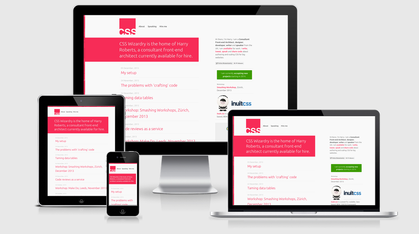
CSS Wizardry is the home of the infamous Harry Roberts. Harry is a well known speaker around the conference circuits and is the talented fellow behind InuitCSS.
The CSS is full compressed as you would expect and includes nomalize, and judging by the bubbling
@media
rules throughout the CSS file I can assume Harry is using a preprocessor of some kind for his CSS.
Strangely if you head over to the /work/ section the viewport is changed to
<meta name="viewport" content="width=device-width, minimum-scale=1.0, maximum-scale=1.0">
There’s no jQuery to be seen, and in fact the only JS that I came across was for Google Analytics and Smooth Scroll 2.3 in the work section (but even that is printed in script tags rather than making another HTTP request).
CSS Wizardry Technical Details
Site Meta Tag
<meta name="viewport" content="width=device-width, minimum-scale=1.0">Media Queries
@media screen and (min-width: 480px)

@media only screen and (min-width: 481px) and (max-width: 939px)

@media only screen and (max-width: 939px)

media only screen and (min-width: 940px)

@media only screen and (max-width: 480px)

@media screen and (min-width: 640px)

@media screen and (min-width: 1100px)
 A notebook you'll actually carry every day.